Palm Springs’ iconic mid-century homes stand out with their playful modernist aesthetic, but behind the glass and clean lines lie human truths. Overlaid text reveals the regrets, anxieties, and quiet despair of the people who inhabit these iconic spaces. A collision of design utopia and real-life angst, this series asks: what do our homes say about the lives we live inside them?
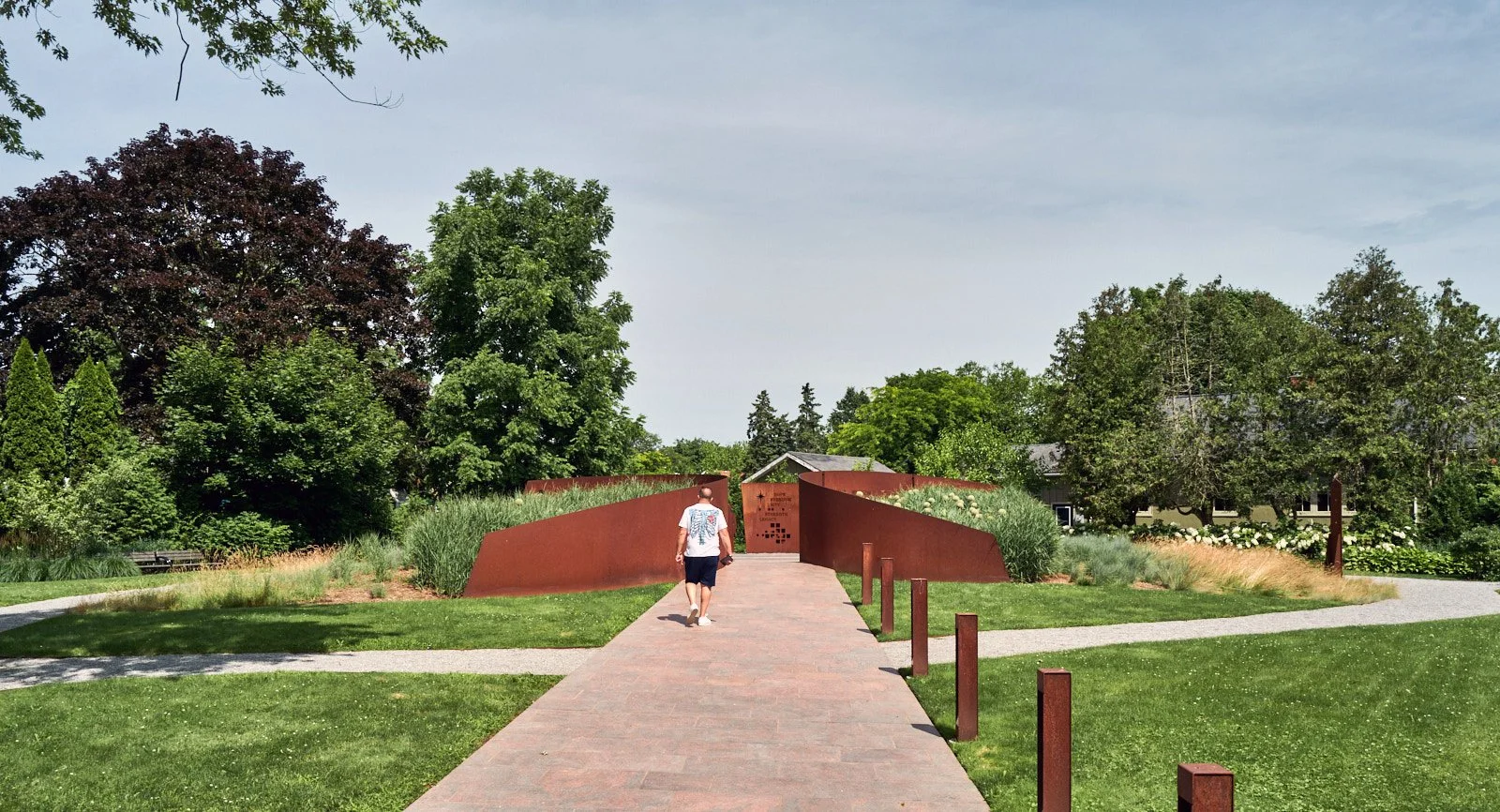
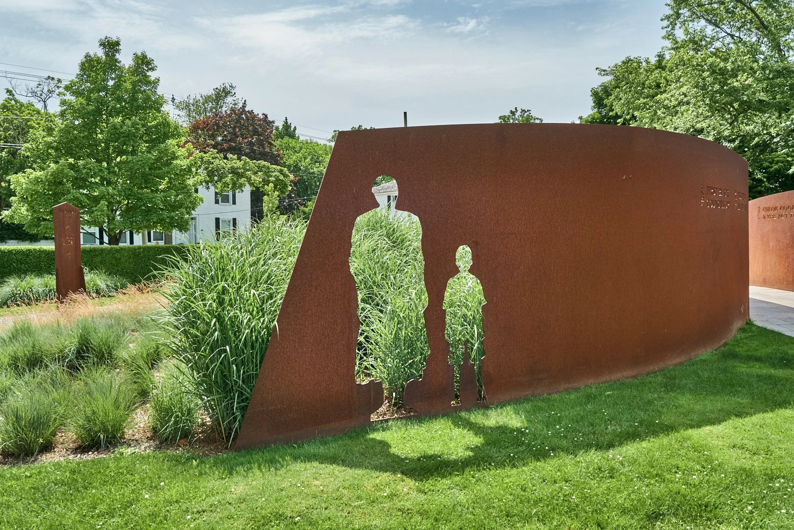
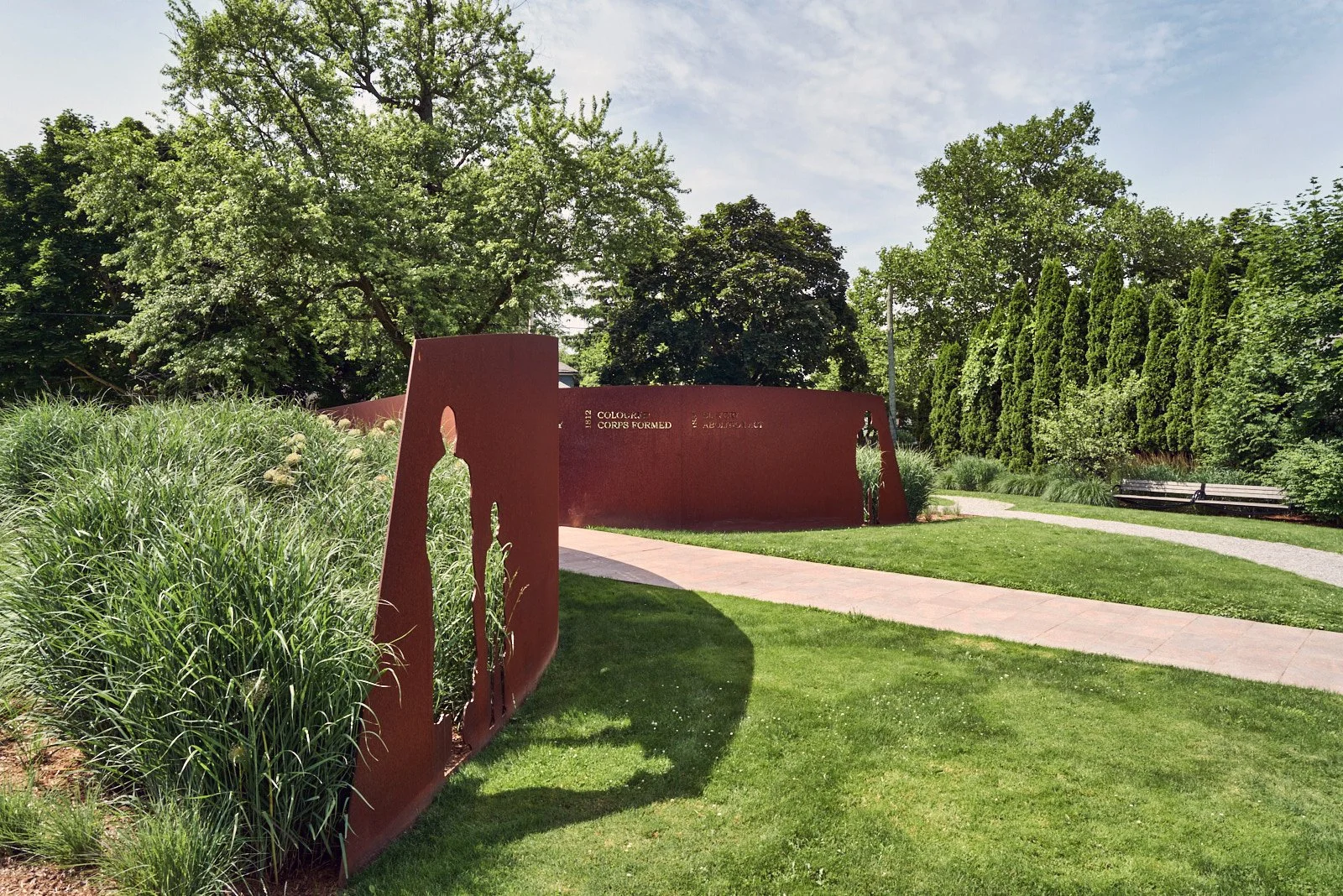
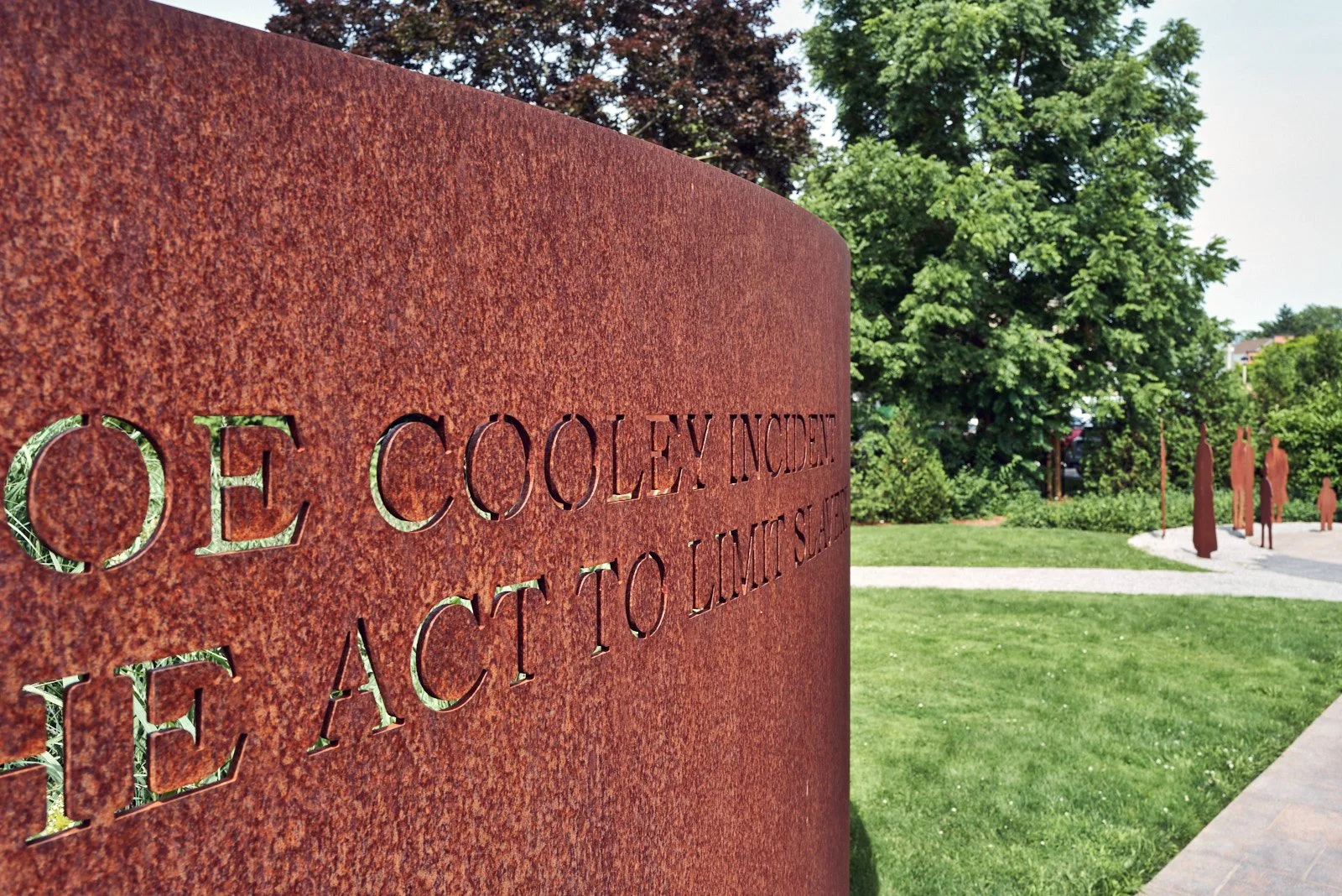
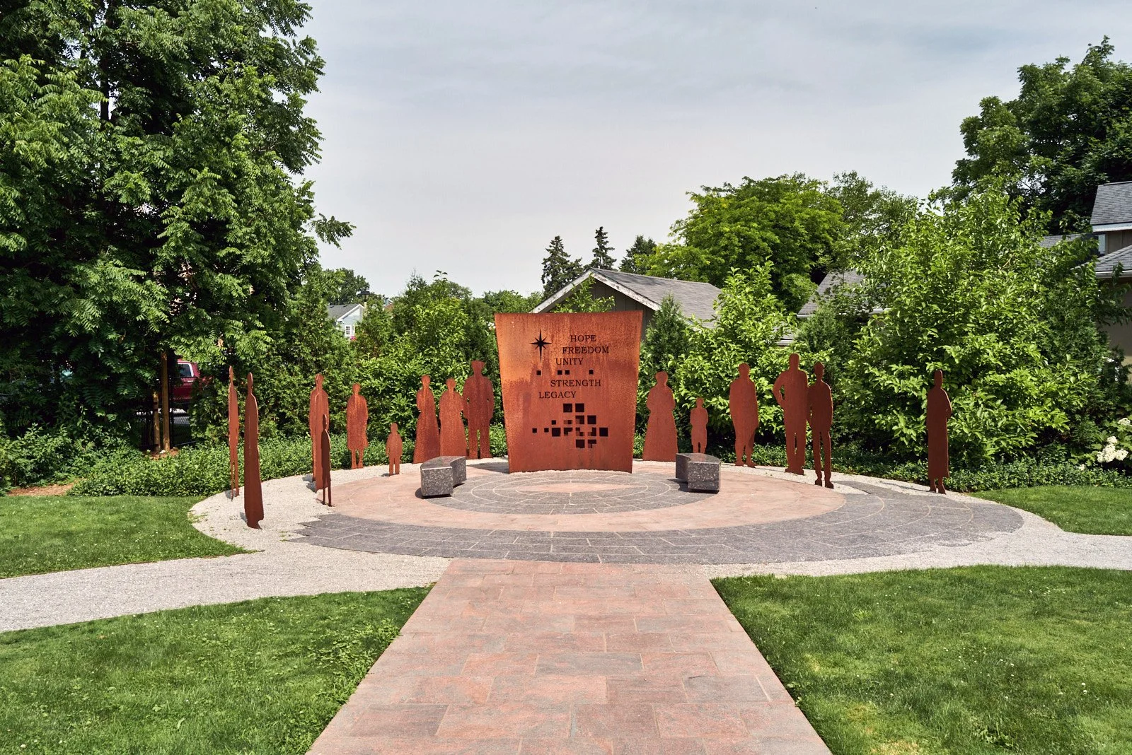
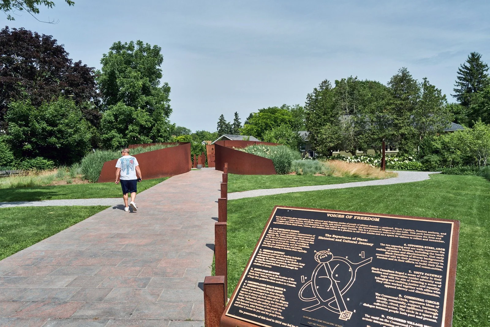
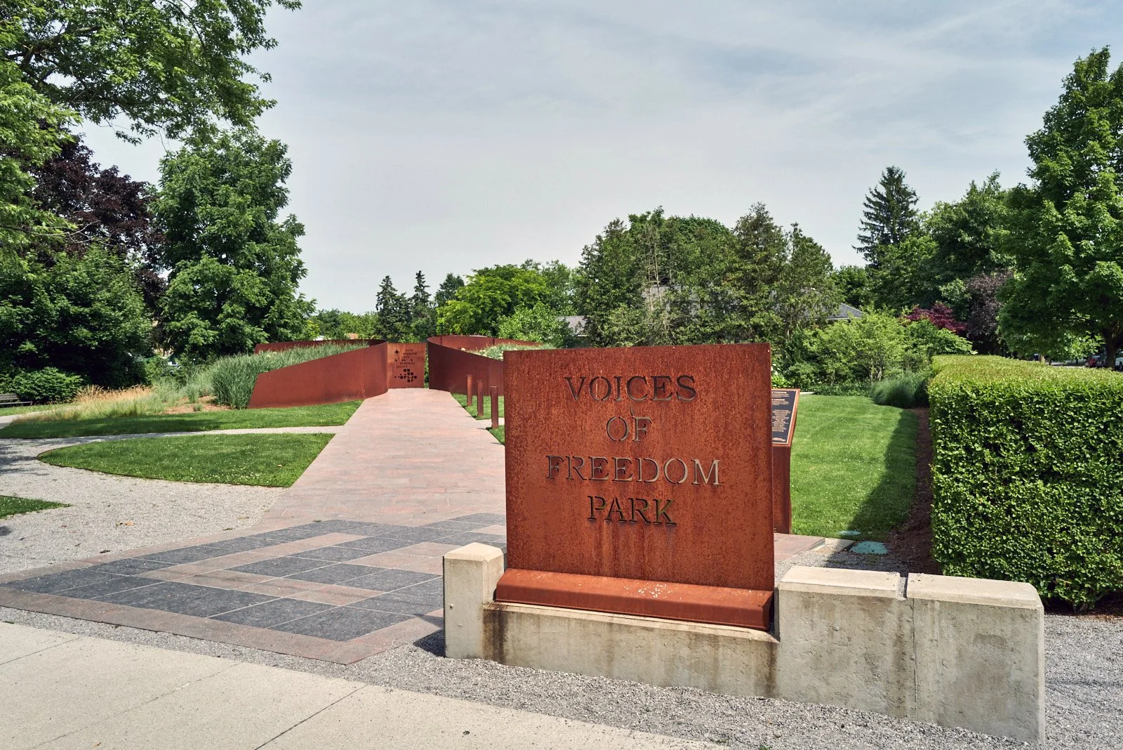
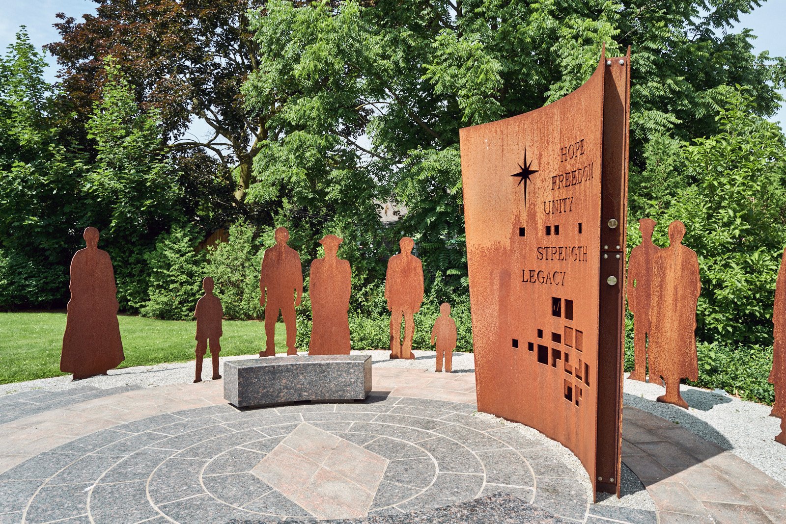
Tom Ridout designed Voices of Freedom as an art piece to encompass the whole site. The resulting creation supports a strong experiential narrative by combining sculptural art with park design.
BACKGROUND
The Request for Proposal for the site called for an artist to ‘memorialize and celebrate the Town’s Black history’ by engaging and educating visitors. The broader concepts of struggle, journey, dialogue and community were also identified as necessary components of the piece. It was clear that the story of the Town’s Black history should offer visitors both written and allegorical information to create a richer experience. The design of Voices of Freedom encompasses the whole site. The site supports a strong experiential narrative by combining sculptural art with park design. By moving away from a traditional static memorial approach we increased the possibilities for successful engagement and education about our Black history.
DESIGN
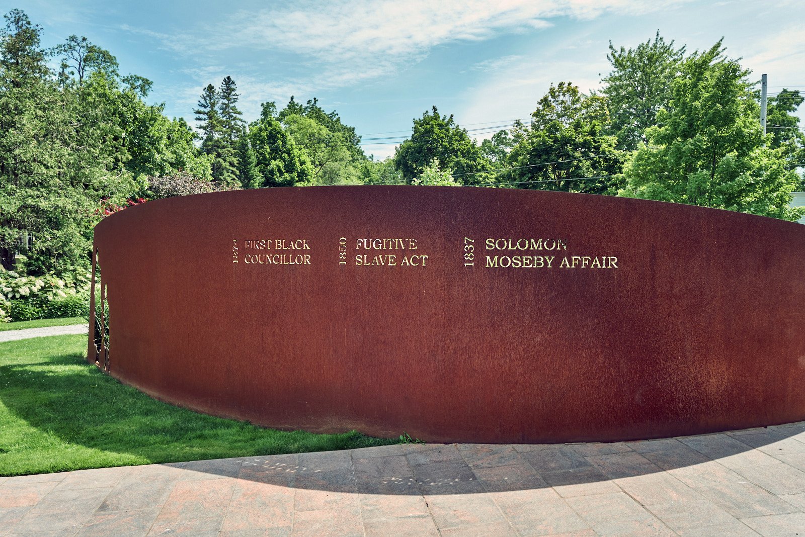
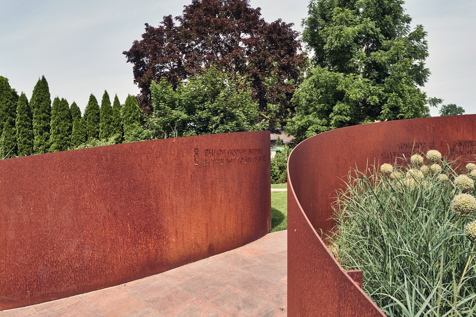
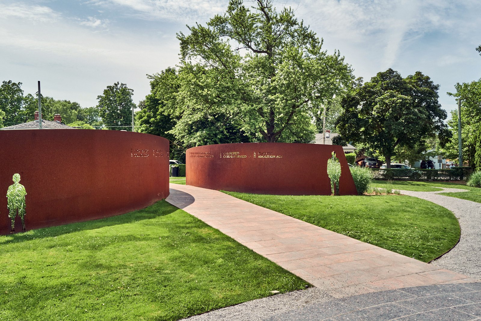
Voices of Freedom brings visitors on a journey of awareness and appreciation for the lives and experiences of Black men, women and children in slavery and ultimately freedom. As visitors move through the space, they interact with the various components visually and physically. The information provided in the historical narrative is supported by the artistic expression of the steel forms. The art installation is comprised of four linked components: Park entry, Main path, Passage to Freedom, and the Communal Circle.
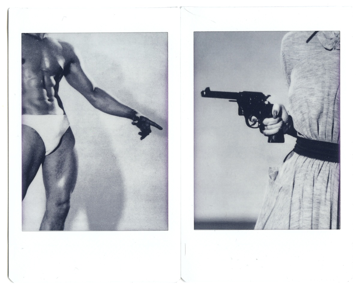
In a world that is moving towards a “post-literate” state, the image is key to carrying meaning, as vulnerable as it is to redefinition. Connotations exploits this instability by pulling images old and new from a variety of sources and juxtaposing them in miniaturized, ever-referential photo-collages.
By reprinting a mix of found and self-taken photographs on Polaroid-style instax prints, the series aims for an impressionistic approach to photography. Beyond the nostalgic sentimentality that instax prints grant the images, the scale encourages viewers to get close to the work, inspecting it carefully, looking beyond the contents and into the contexts. Rather than viewing the works as singular objects, we are encouraged to piece apart the meaning built from their interrelations, their grammar. This, of course, is modulated by the bodies of knowledge that we as viewers—as diverse interpreters of art and history—bring to the table.
In a time when political points are scored from easy answers to complex questions, this series reminds us that the intricacy of the world is inescapable, communicated not only in our images but also in our methods of organization. Our hyperactive, oversaturated visual culture invites this engagement with multiplicity, but how we confront it is ultimately up to us.
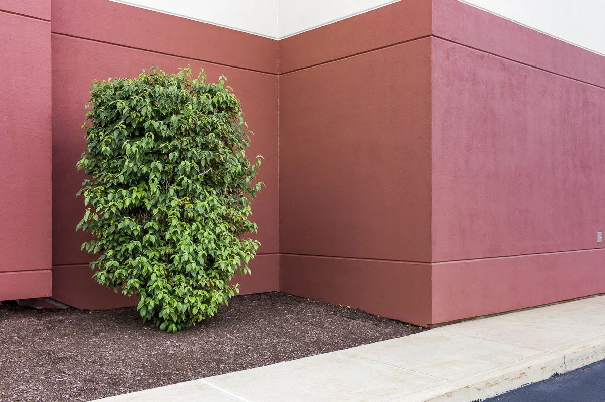
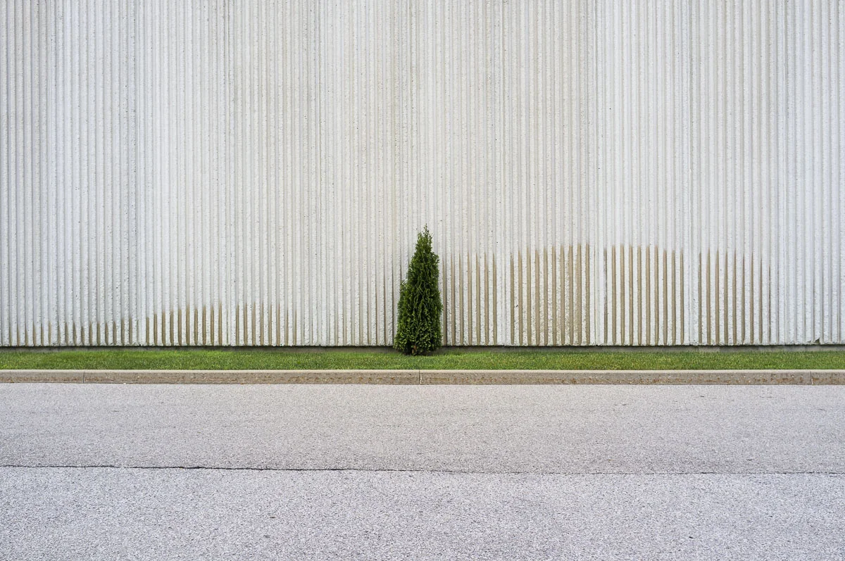
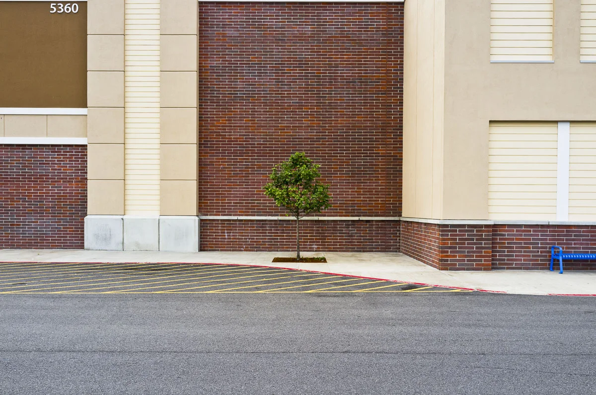
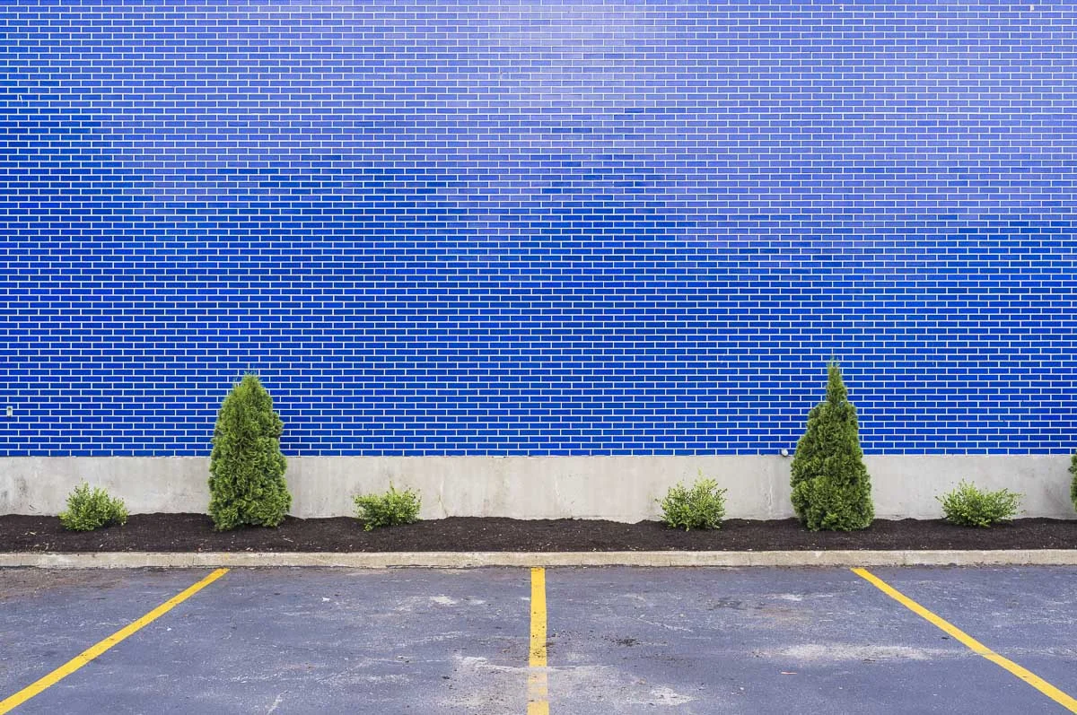
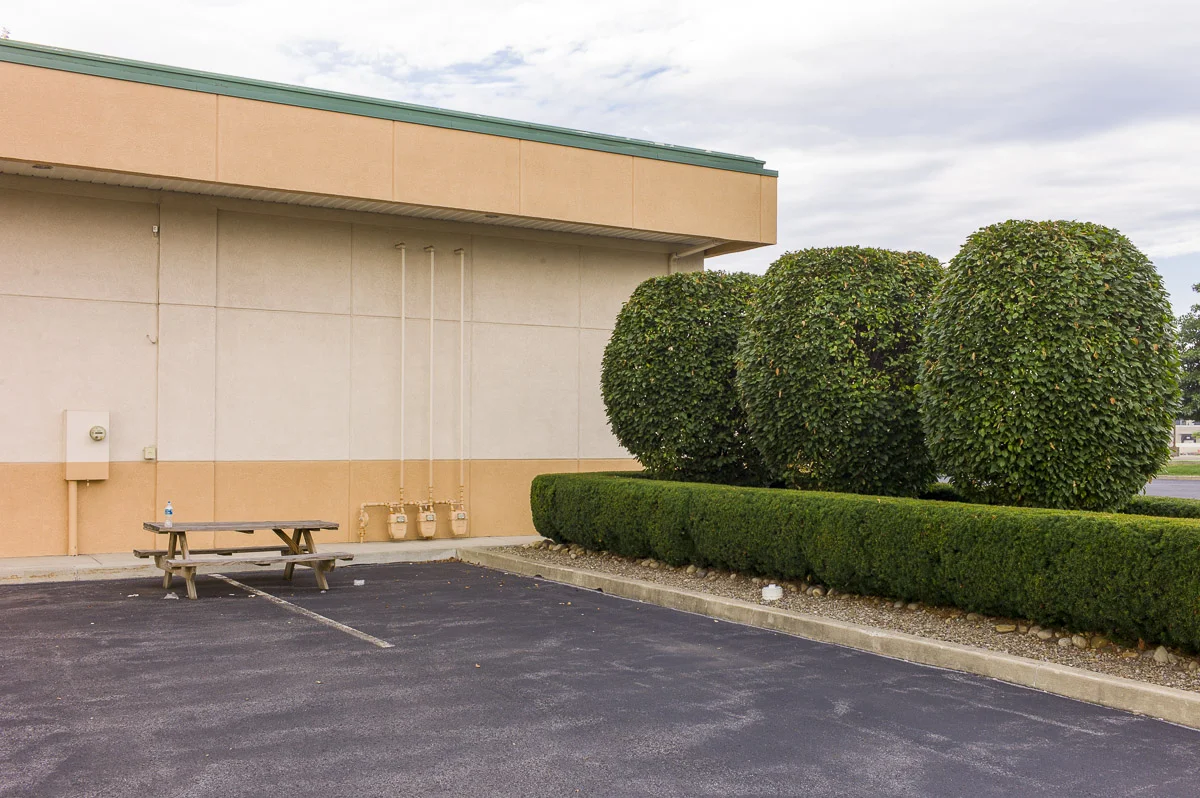
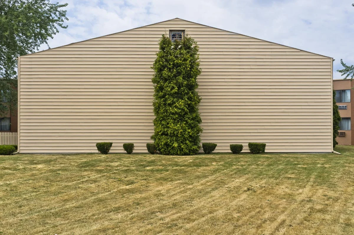
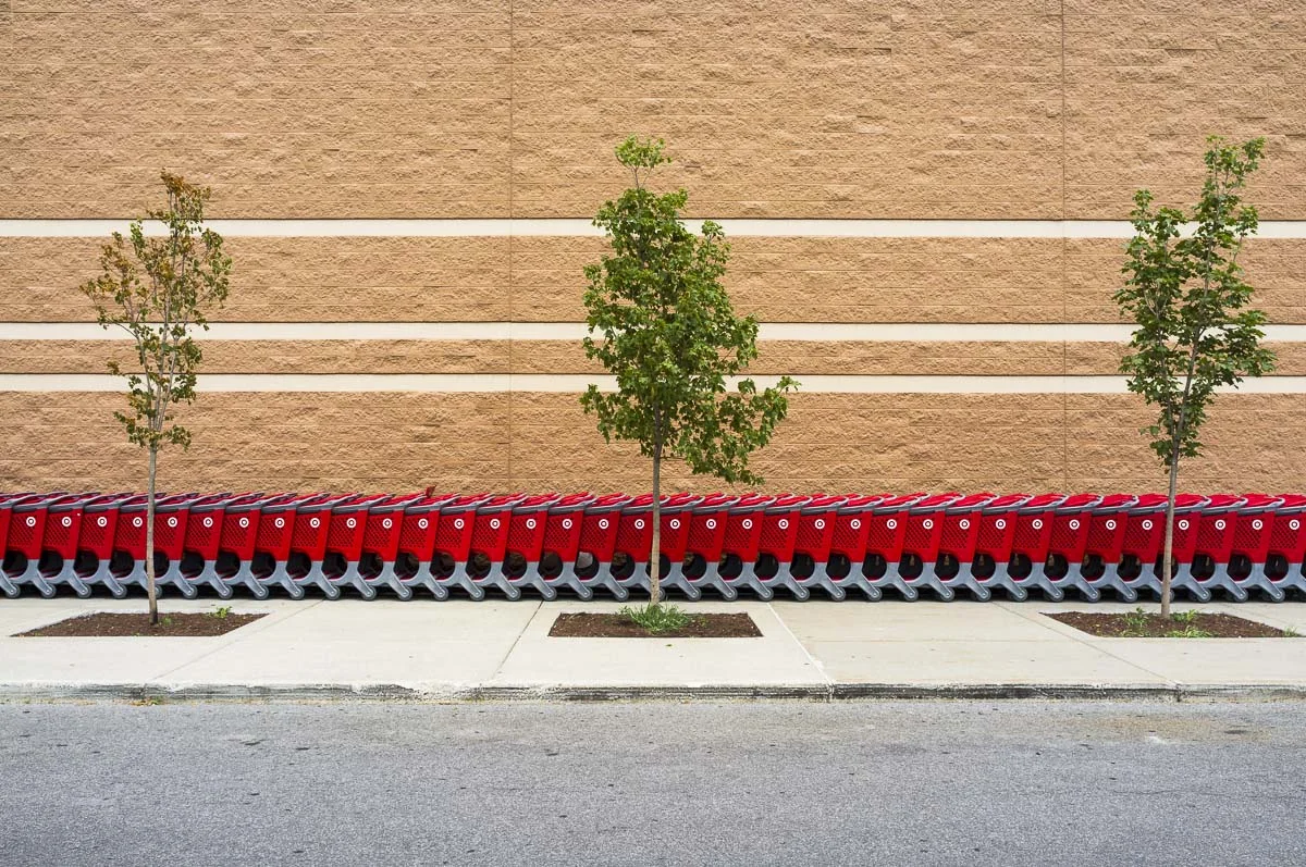
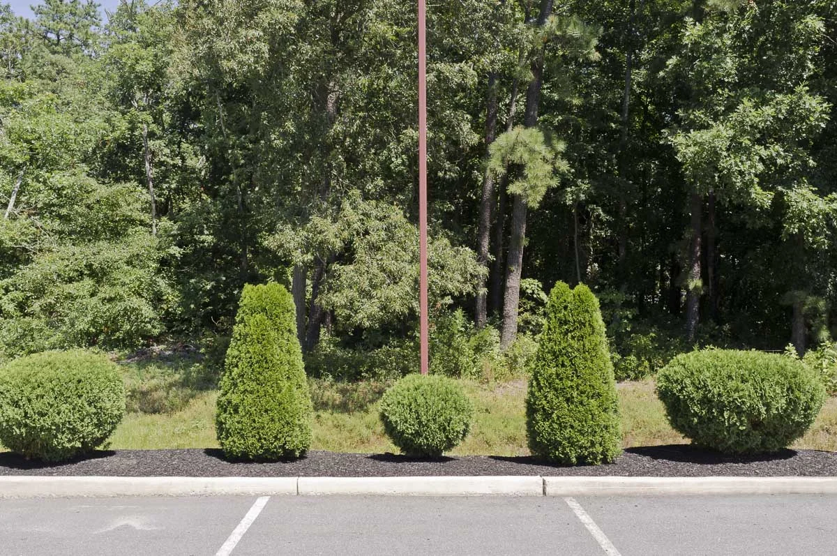
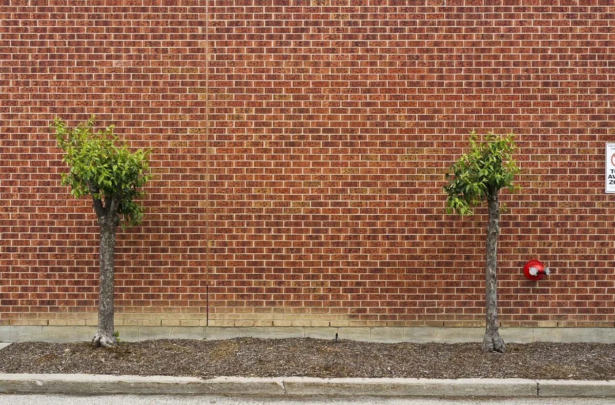
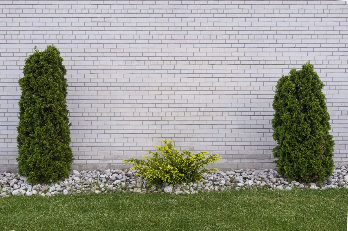
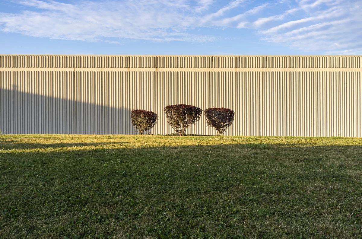
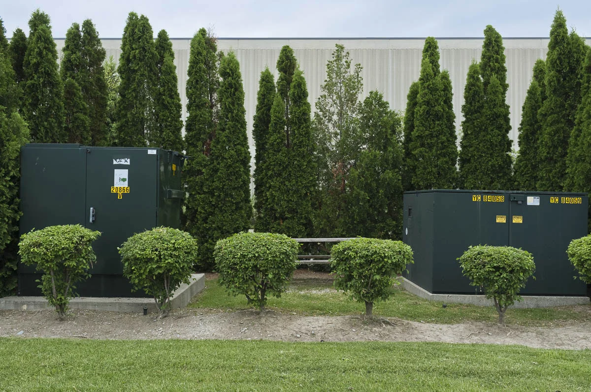
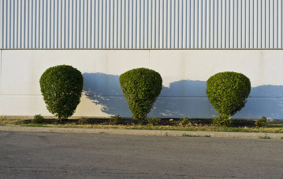
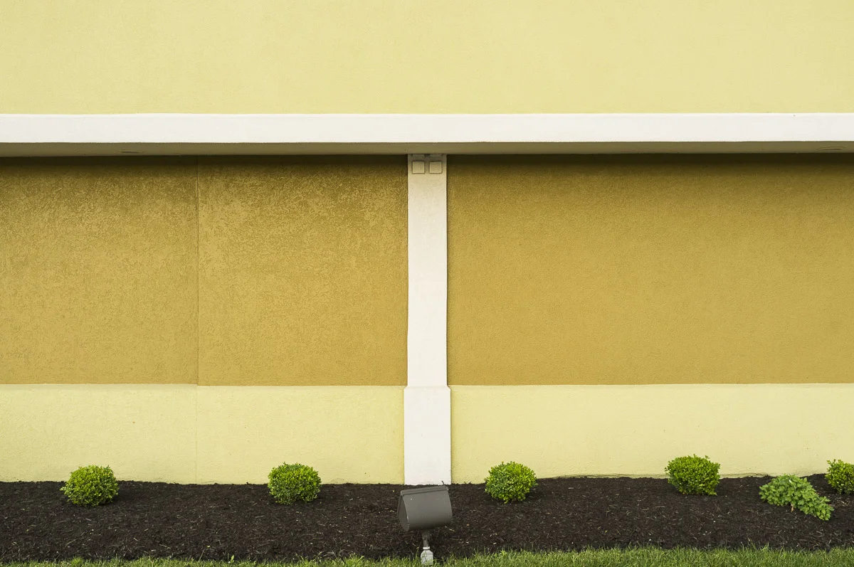
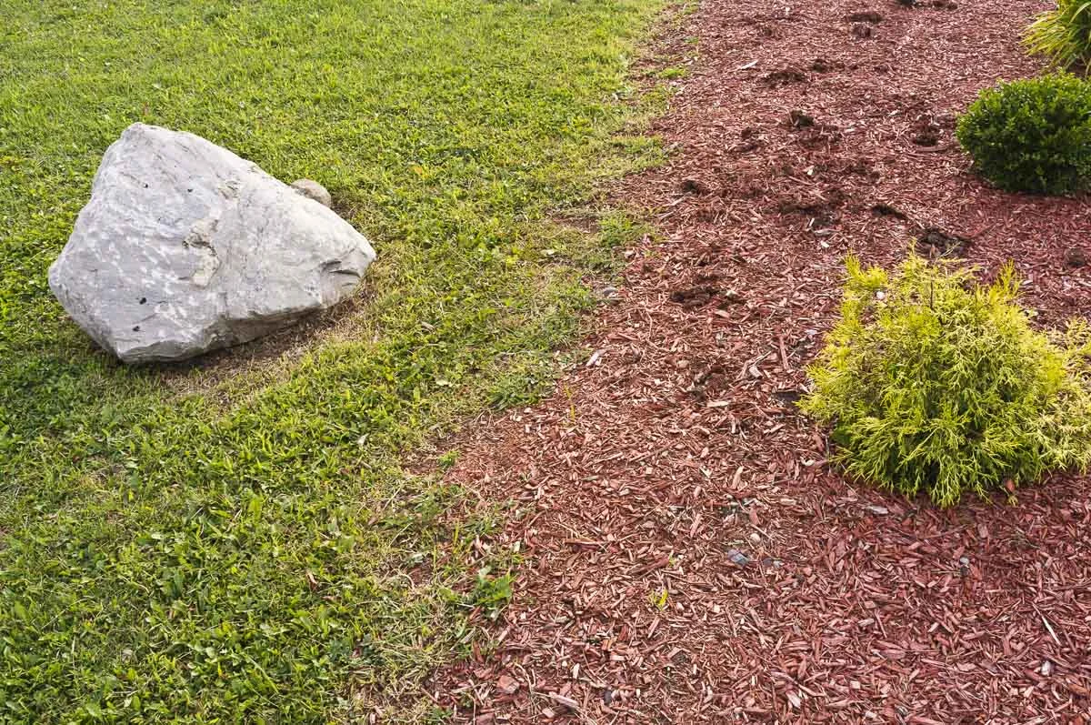
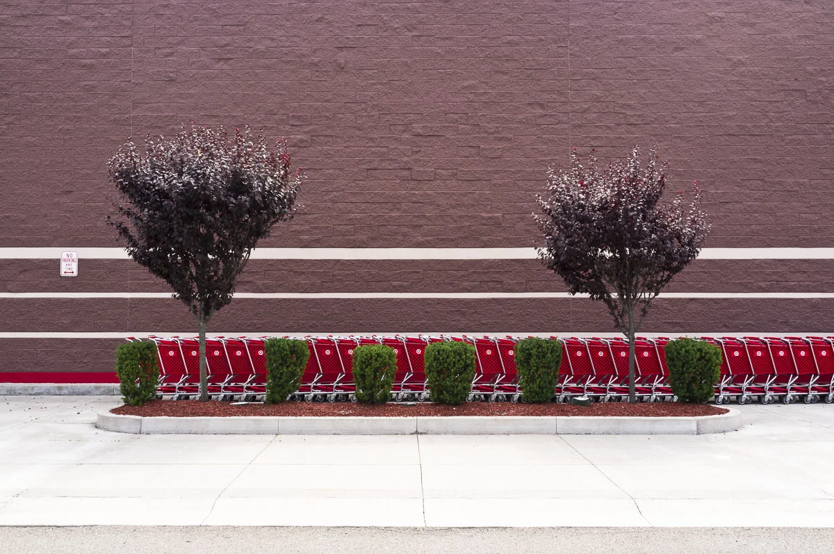
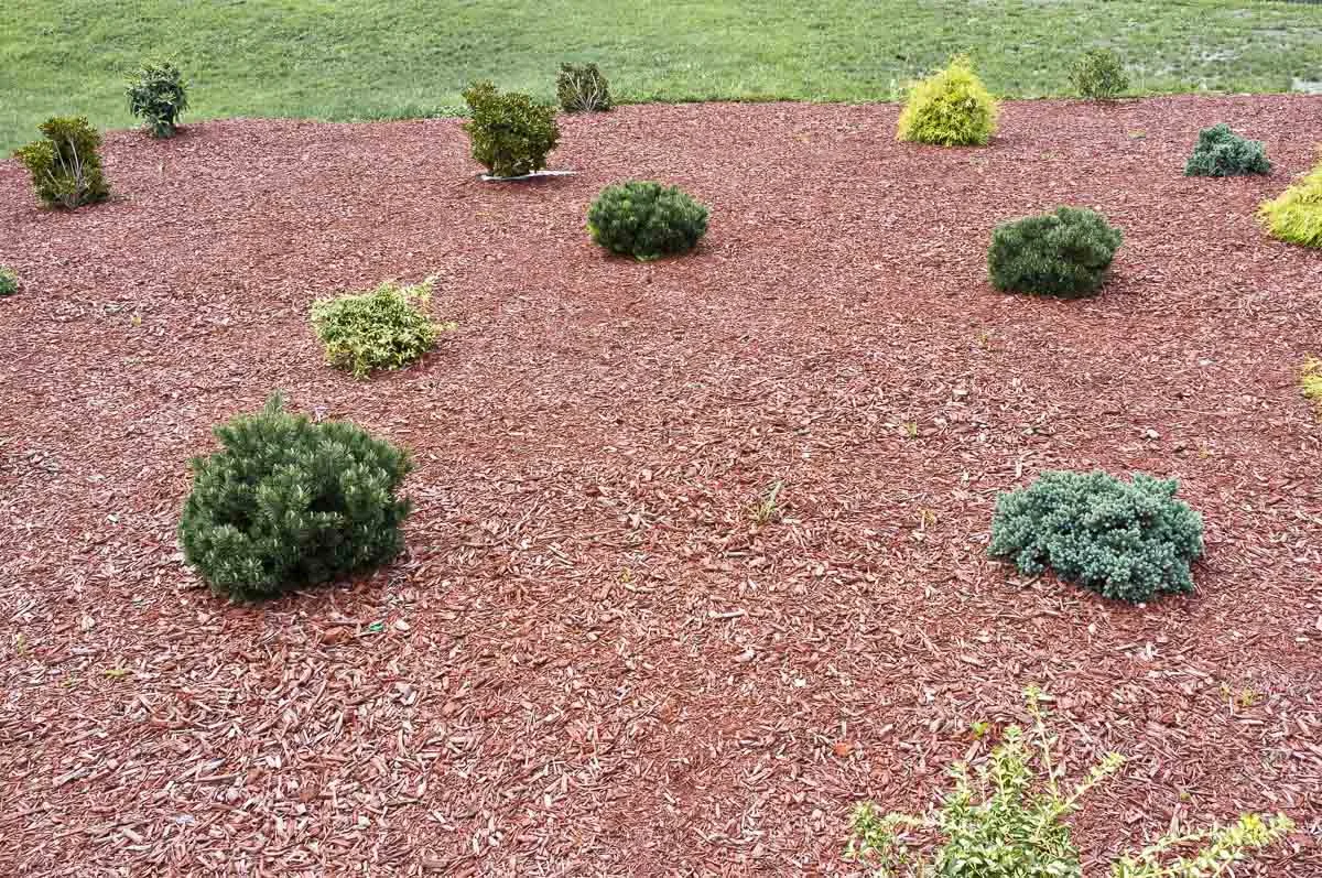
The blandscape series started as a response to the rapid consumption of rural Southern Ontario land for industrial and commercial developments. These small landscape gestures were a replacement for what was lost. There is a striking formality of approach that is in contrast to the insignificance of the landscape design.
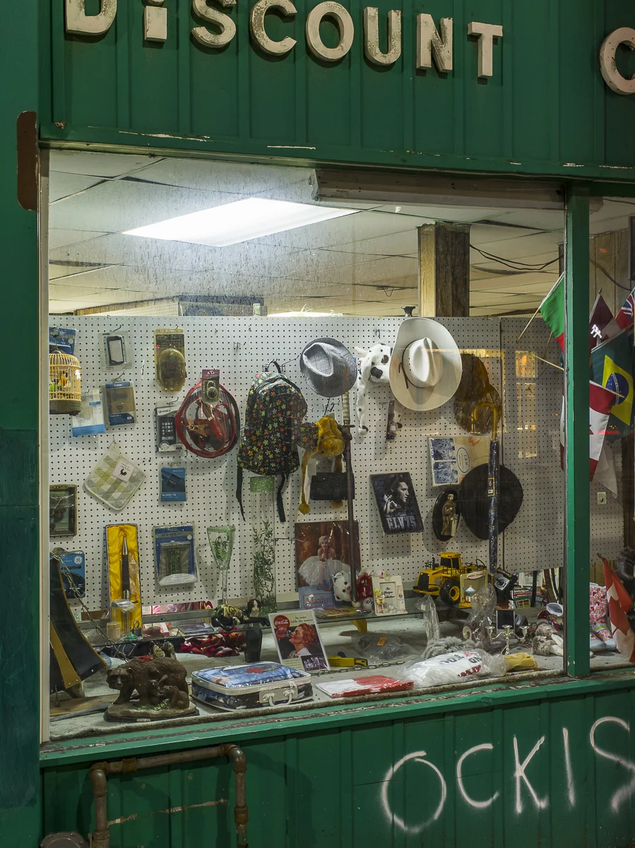
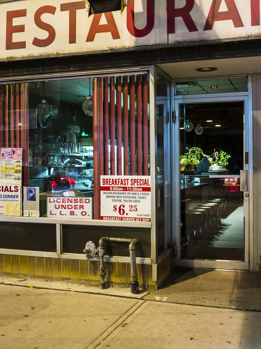
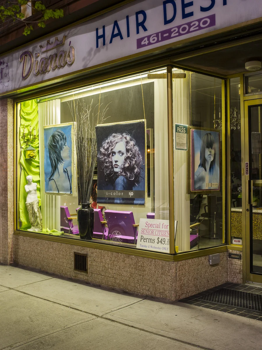
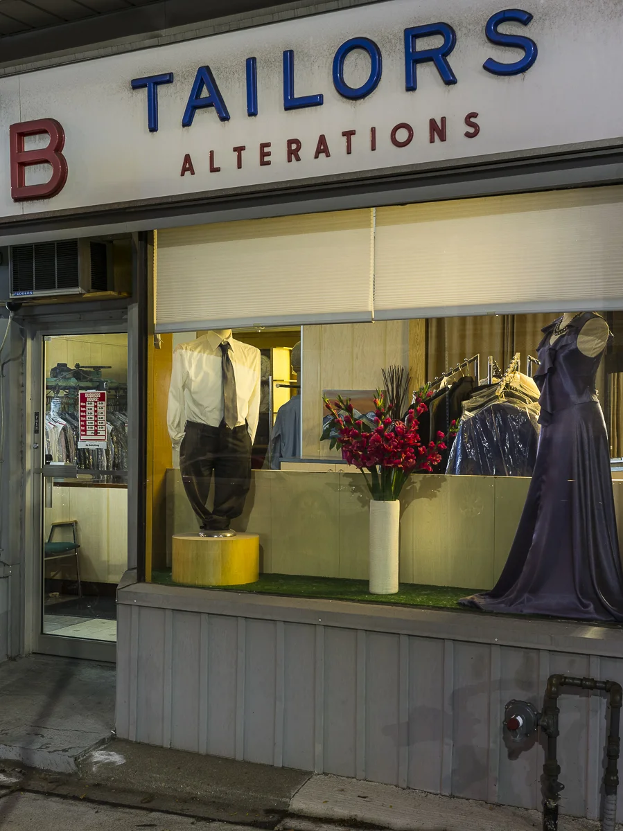
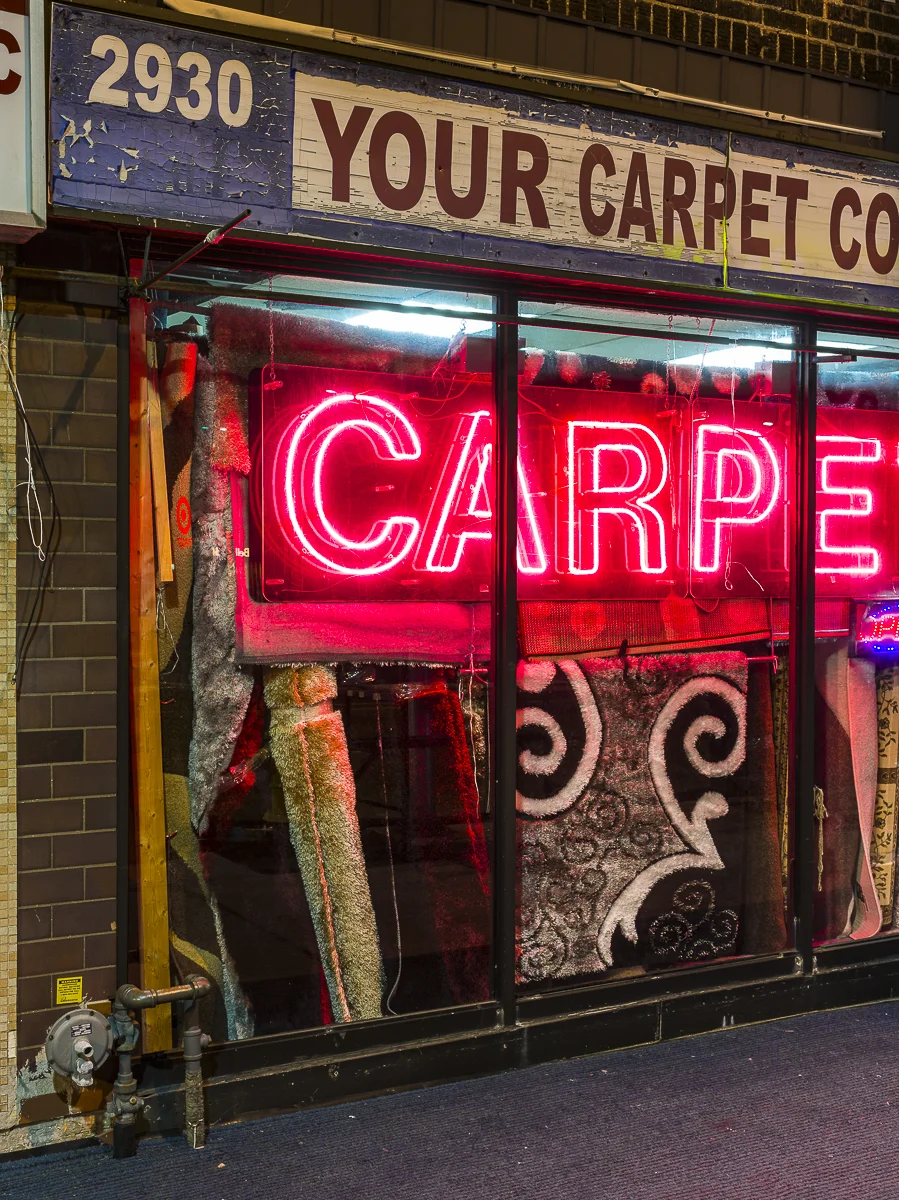
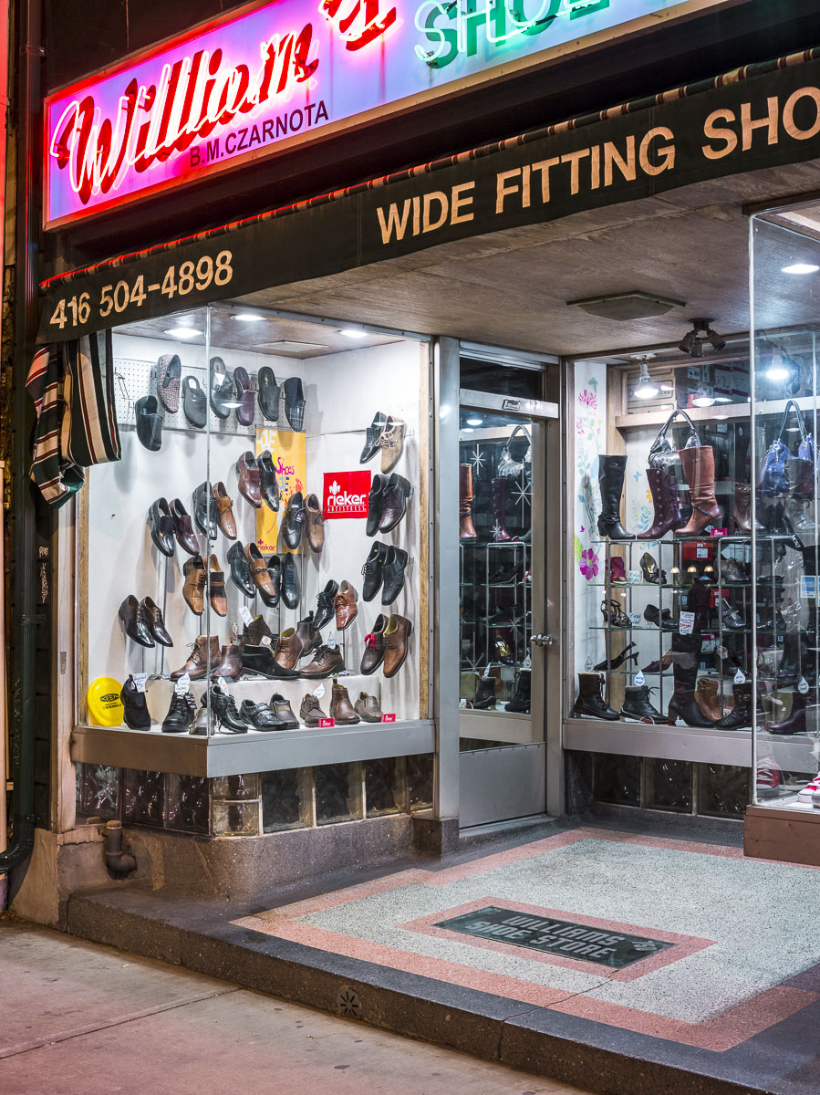
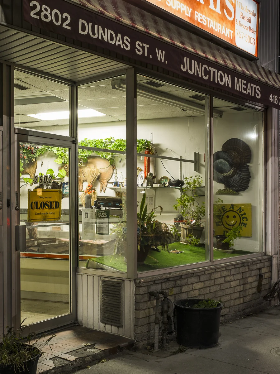
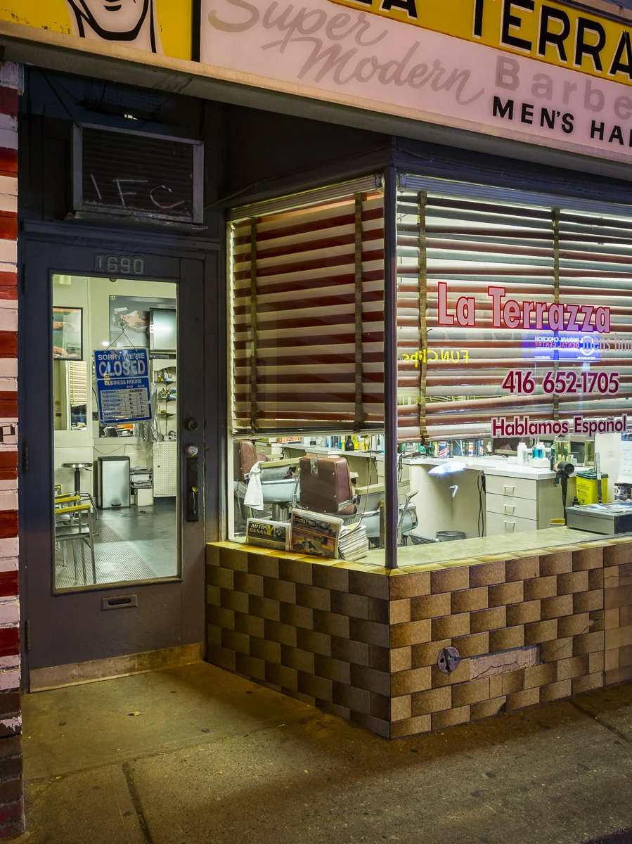
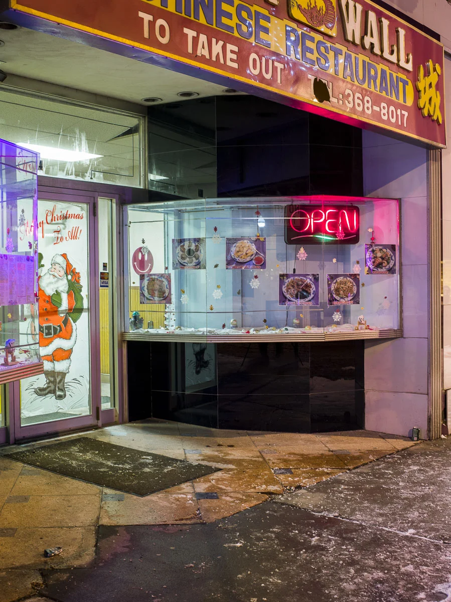
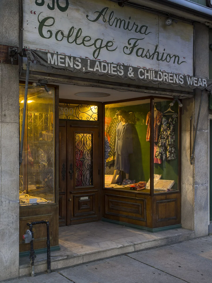
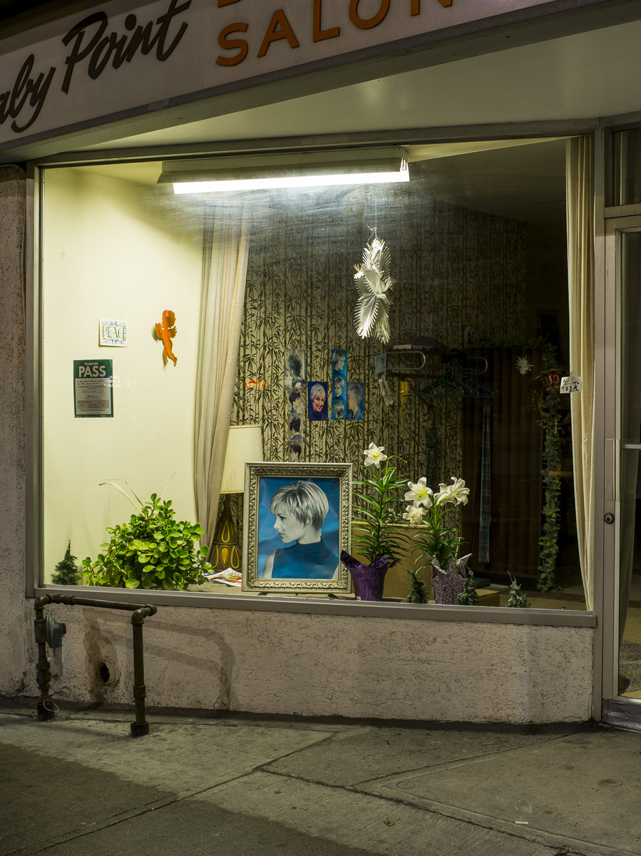
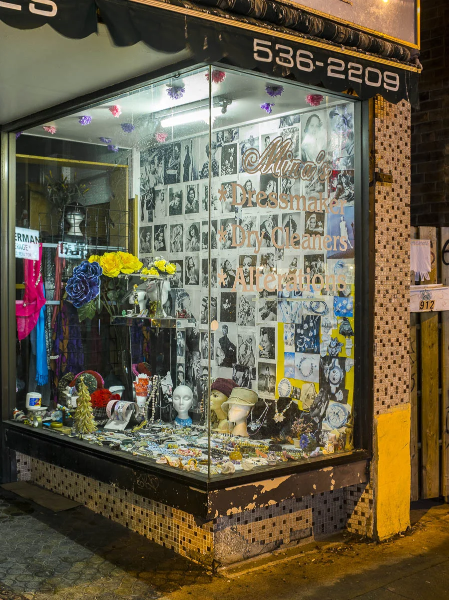
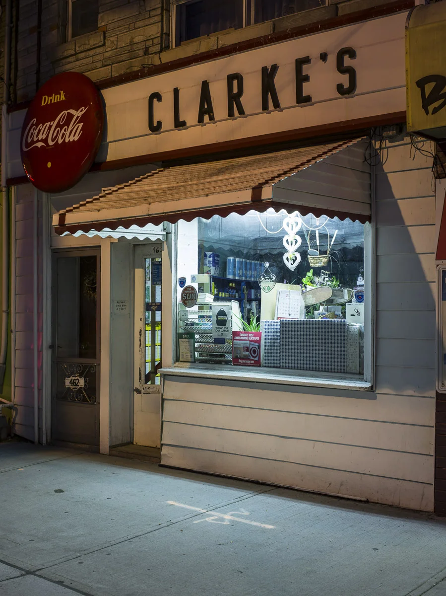
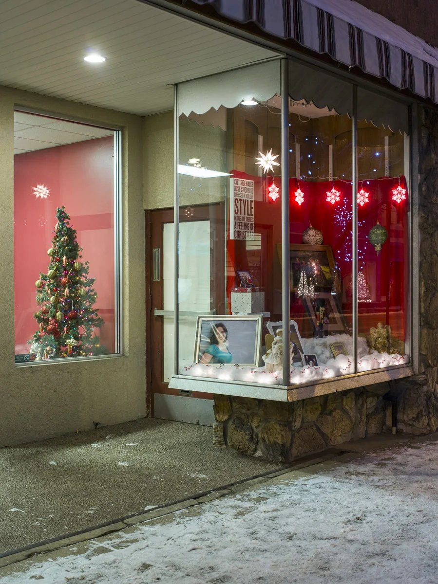
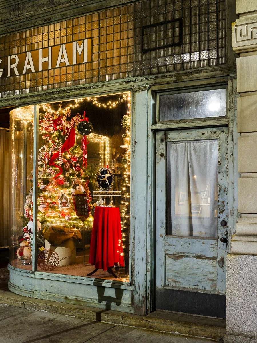
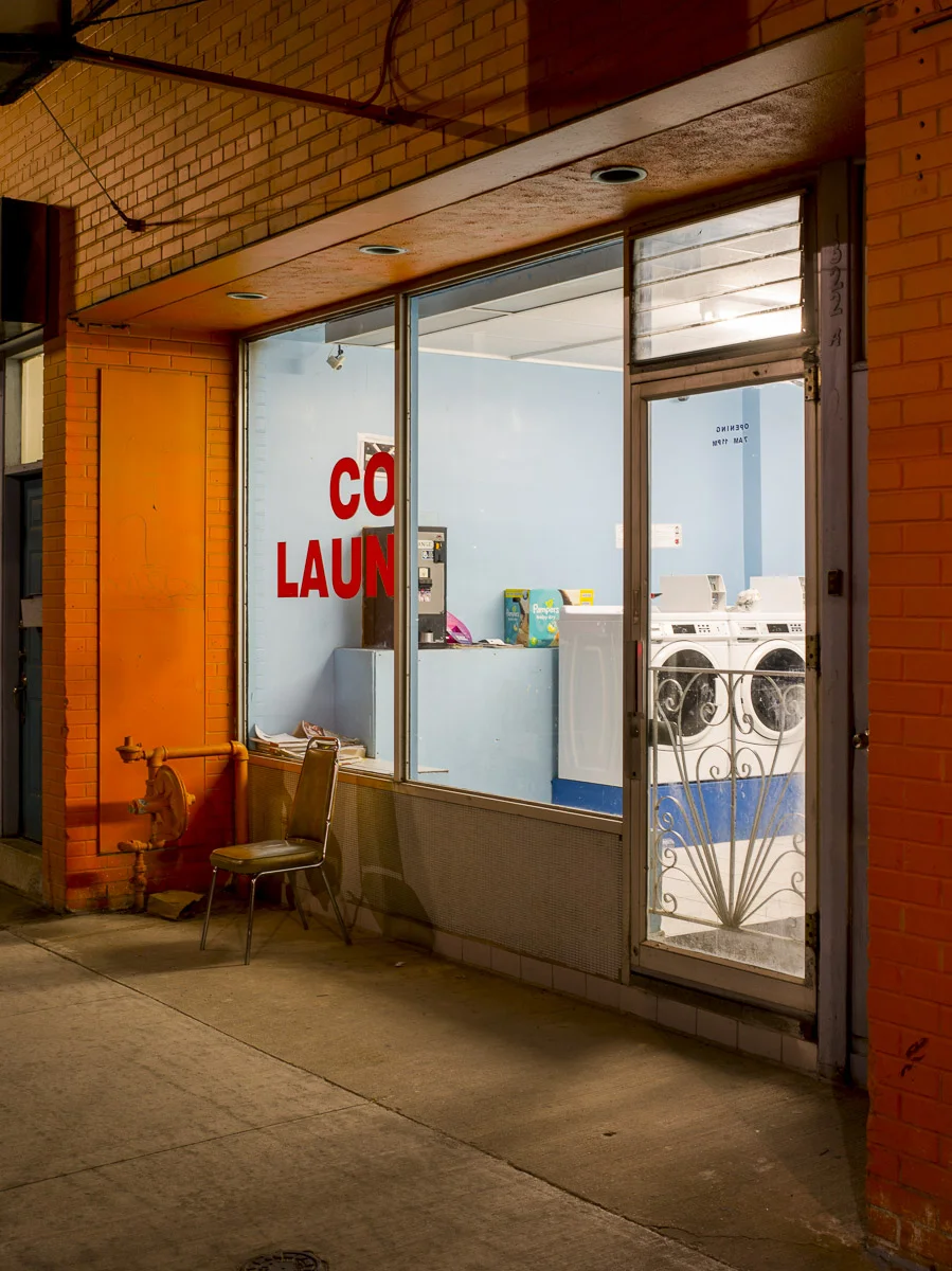
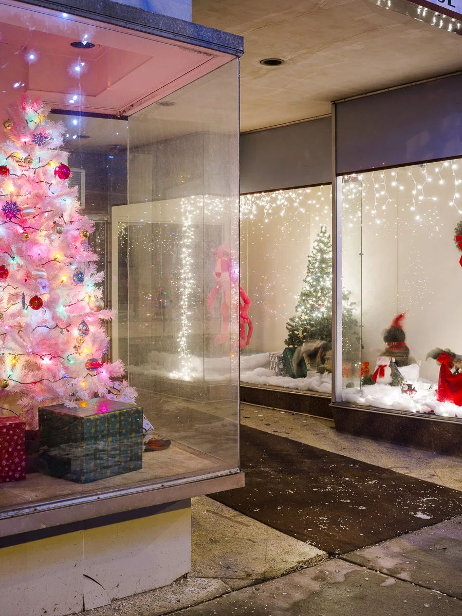
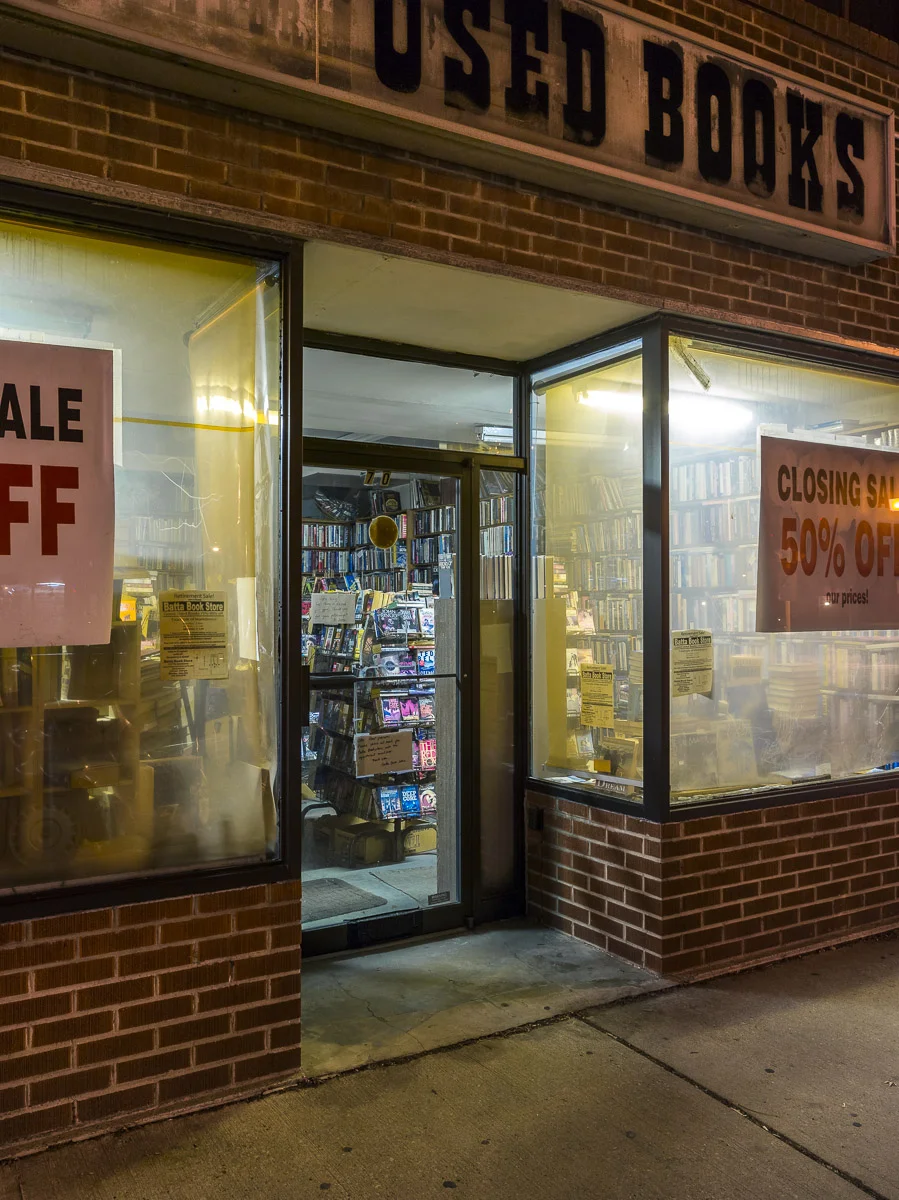
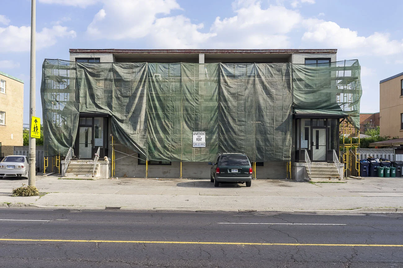
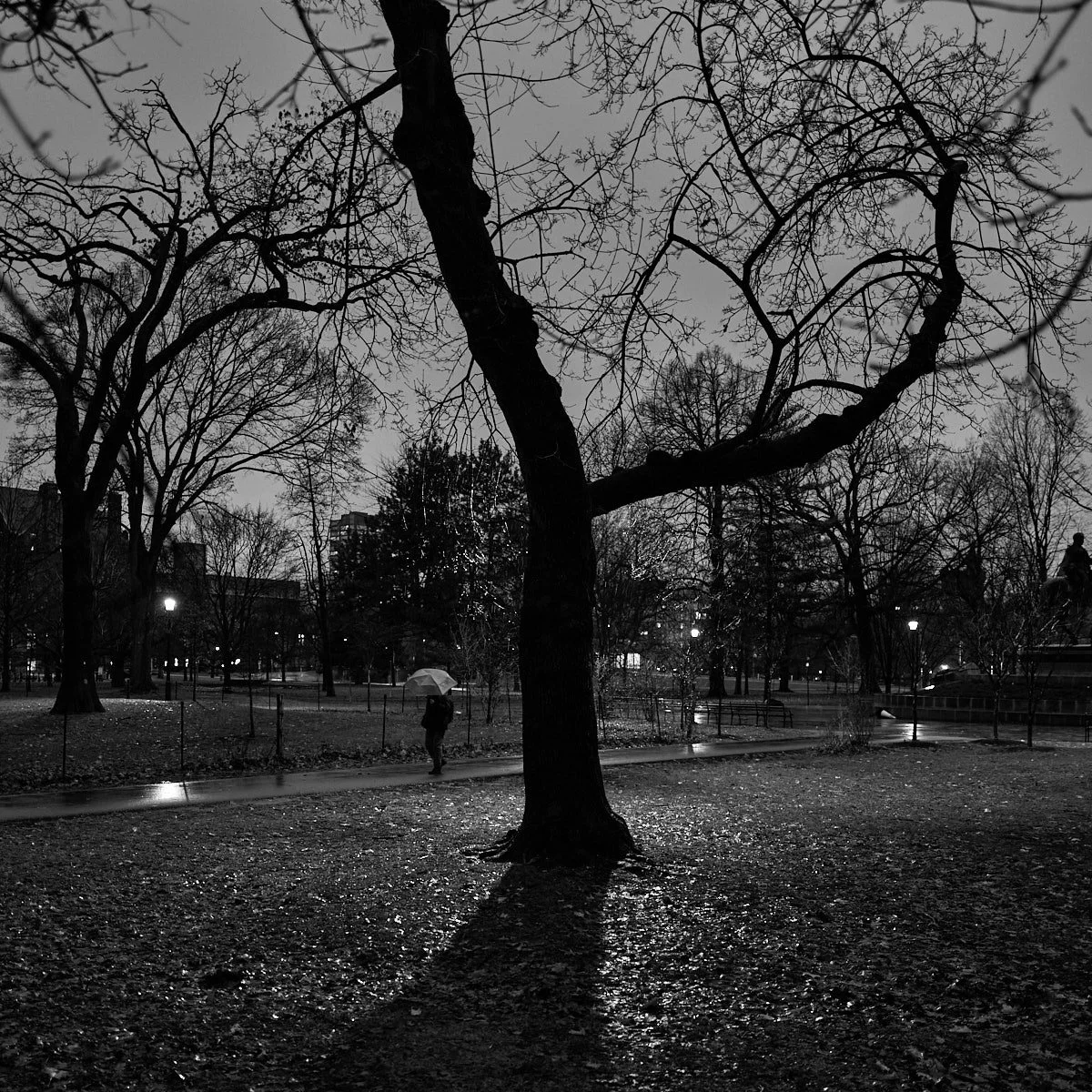
This series documents Toronto storefronts photographed at night, when the glow from within reveals the traces of daily life otherwise hidden behind glass. The darkness outside becomes a frame, focusing attention on interiors where merchandise, furniture, and signage speak of long histories and changing neighbourhoods.
Many of the businesses depicted were photographed during their final years; some have since vanished, leaving only their faint architectural and cultural imprint. These images are not simply records of commerce, but portraits of resilience, decline, and memory. Each storefront becomes a vessel of stories—owners who devoted lifetimes to their work, customers whose routines revolved around these spaces, communities held together by the rhythm of the corner store, the barber shop, or the diner.
By photographing them at night, I was drawn to the quiet intimacy of these places on the edge of disappearance. The illuminated interiors, set against the surrounding dark, speak to a tension between presence and absence, continuity and erasure. The work reflects on urban transformation, the fragility of local culture, and the inevitability of loss.
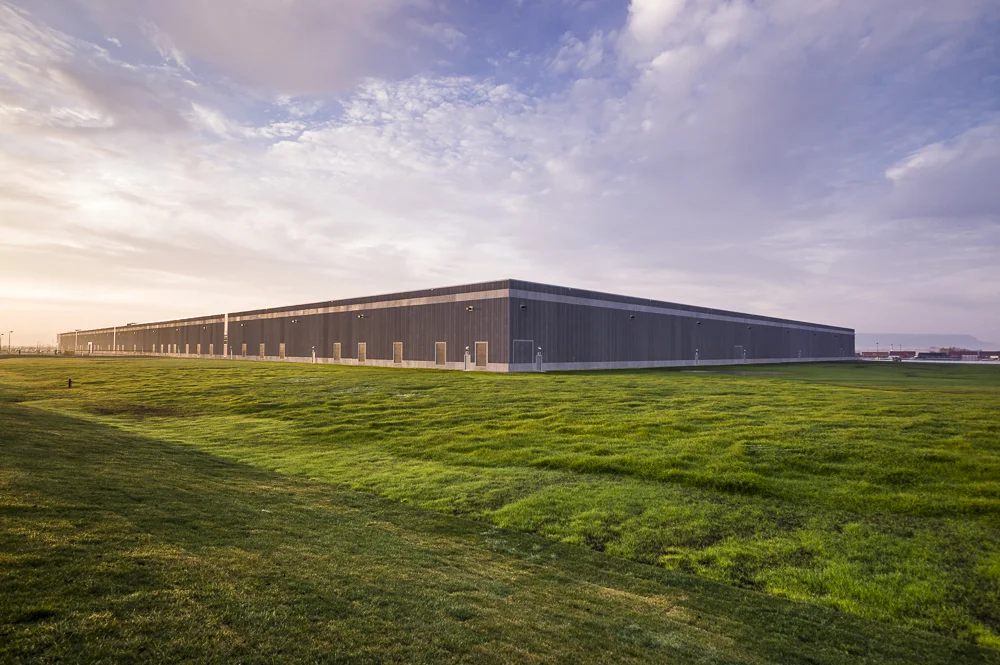
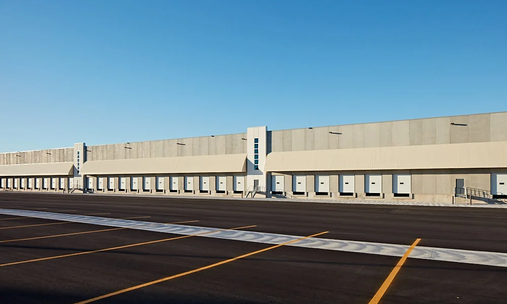
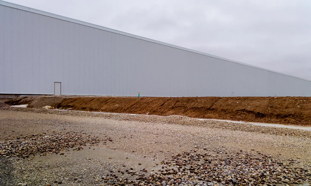
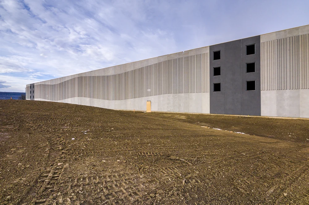
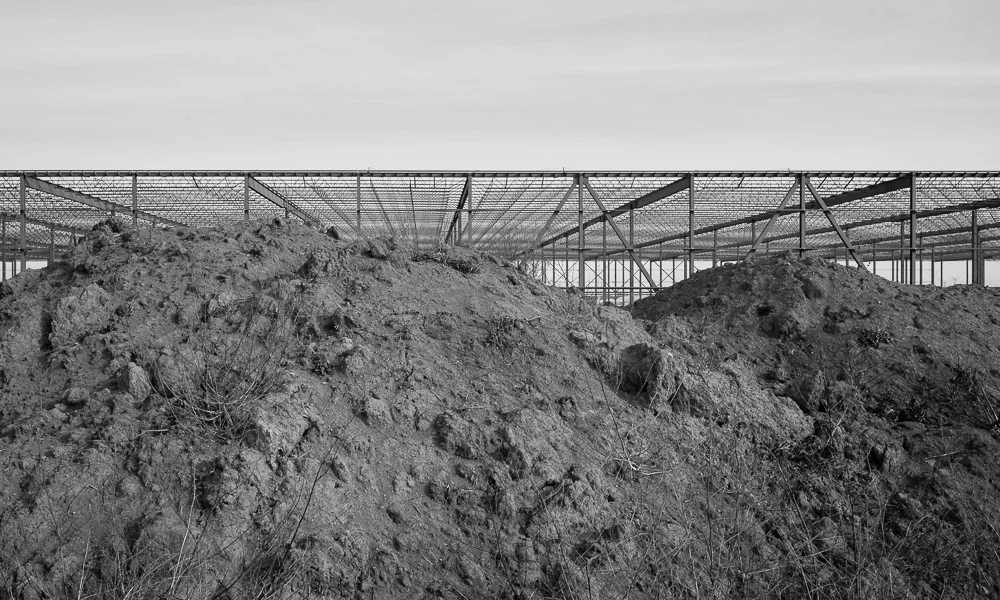
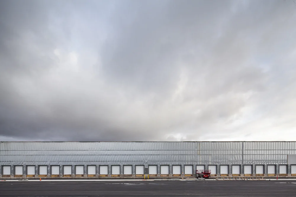
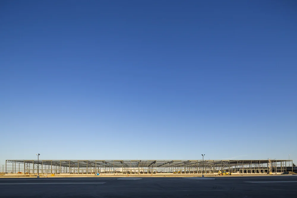
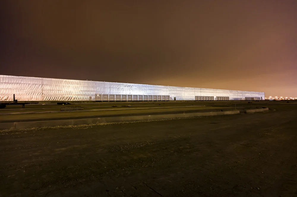
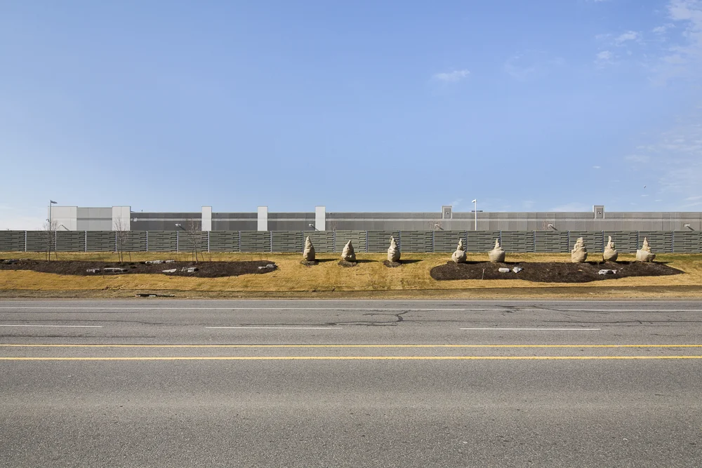
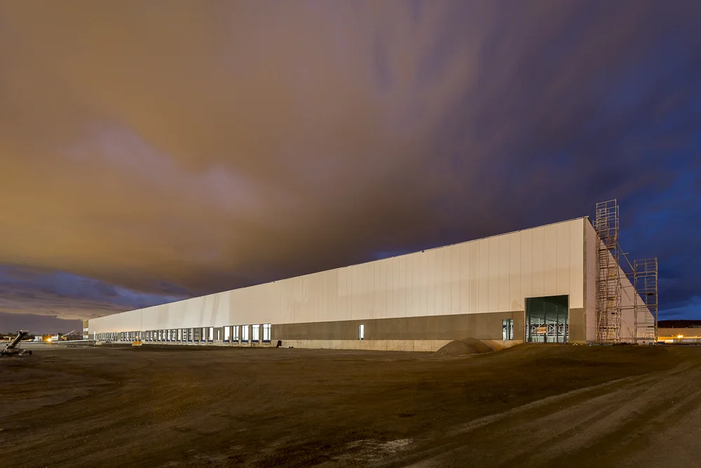
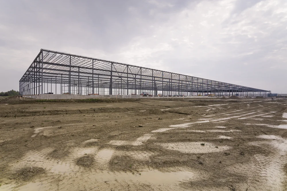
‘Consumed’ is a visual survey of the development of warehouse structures and their impact on the landscape. Production, storage, and consumption of consumer goods are pertinent issues affecting both environmental sustainability and the character of the landscape. With the population of Ontario projected to grow by 4.2 million people in the next 28 years, we can expect a large increase in imported consumer goods to meet demand. Agricultural land on the outskirts of Toronto is already being transformed into major warehouse hubs. Proximity to highways and expansive flat topography make this land perfect for warehouses. Where we once consumed food produced by the land we now consume land to support our insatiable hunger for consumer products. This series received an Ontario Arts Council grant in early 2015 and is currently under development.
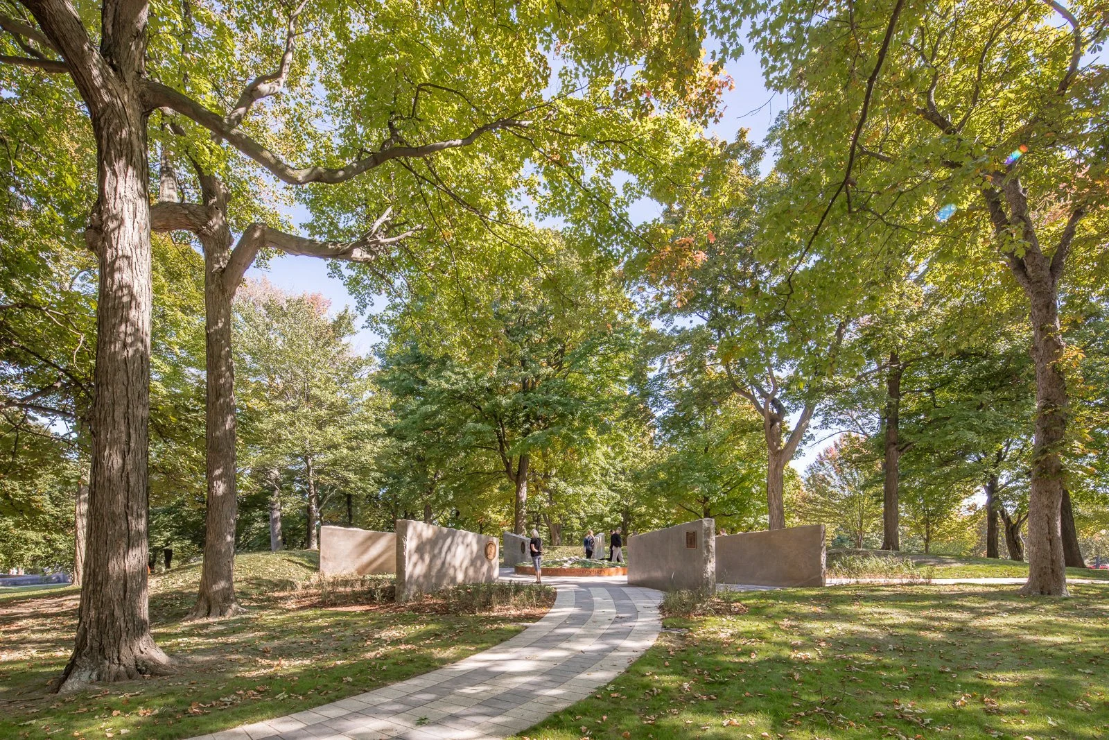
Landscape of Nations is a living memorial set in Queenston Heights Park beside Brock’s Monument, honouring the Haudenosaunee (Six Nations) Confederacy and other Indigenous allies who were pivotal in the War of 1812—and recognizing the 1815 peace and reconciliation council held in Niagara. Visitors enter between bronze statues of war captains John Norton (Teyoninhokarawen) and John Brant (Ahyouwae̱hs), then pass beneath a symbolic “longhouse” and along a walkway patterned after the Two-Row Wampum. At its heart is the Memory Circle: eight Queenston-quarry limestone walls radiate like a sunburst around a bed of sacred sweetgrass; medallions name the Six Nations and Native allies. An eastern white pine—the Tree of Peace—marks the memorial’s exit.
Unveiled on October 2, 2016, the memorial was designed by Tom Ridout in collaboration with Six Nations artist Raymond Skye (who created the Norton and Brant sculptures), with the project co-chaired by Tim Johnson and Richard Merritt. The site weaves through the historic earthworks of Fort Riall, blending battlefield landscape with contemporary public art to affirm Indigenous peoples’ central place in Canadian history.
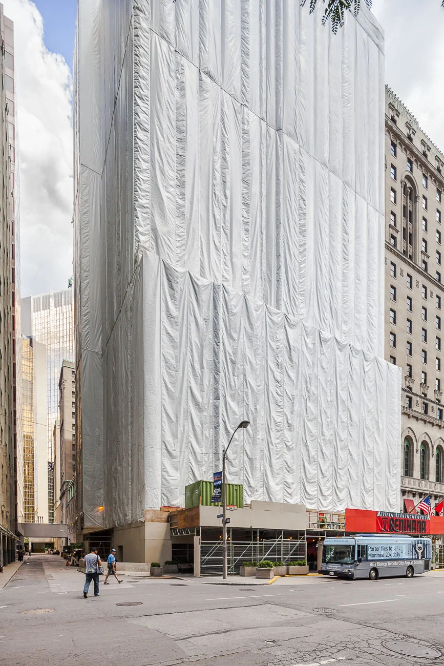
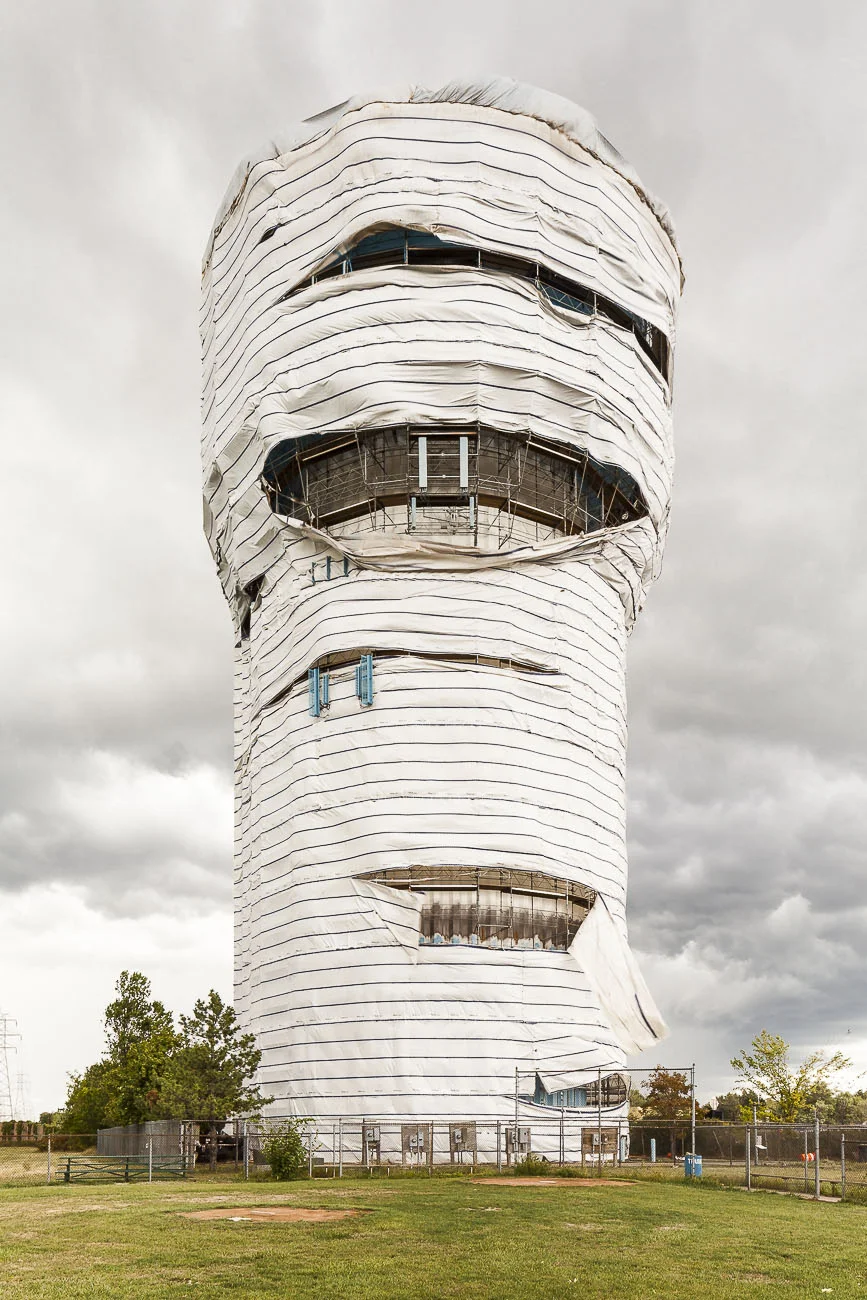
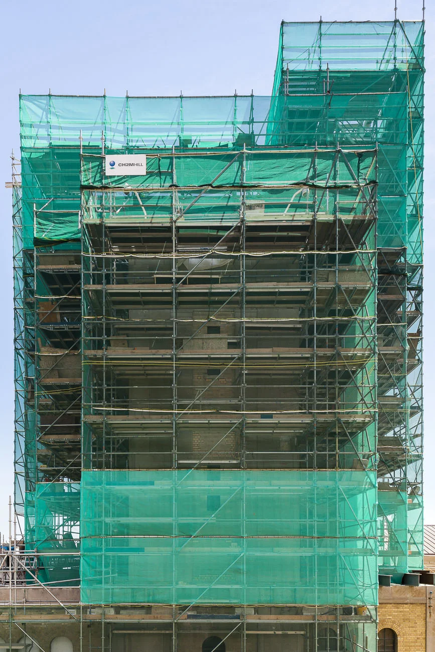
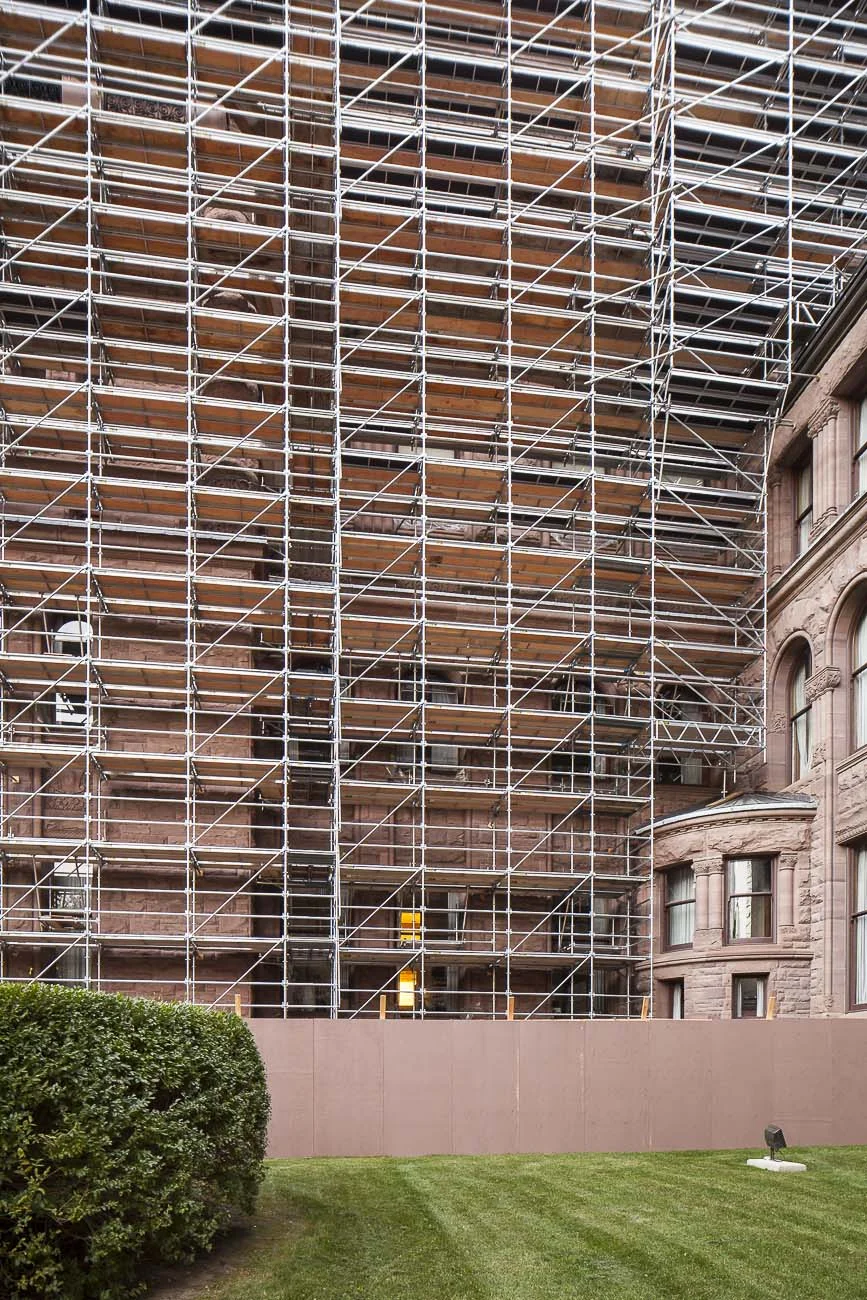
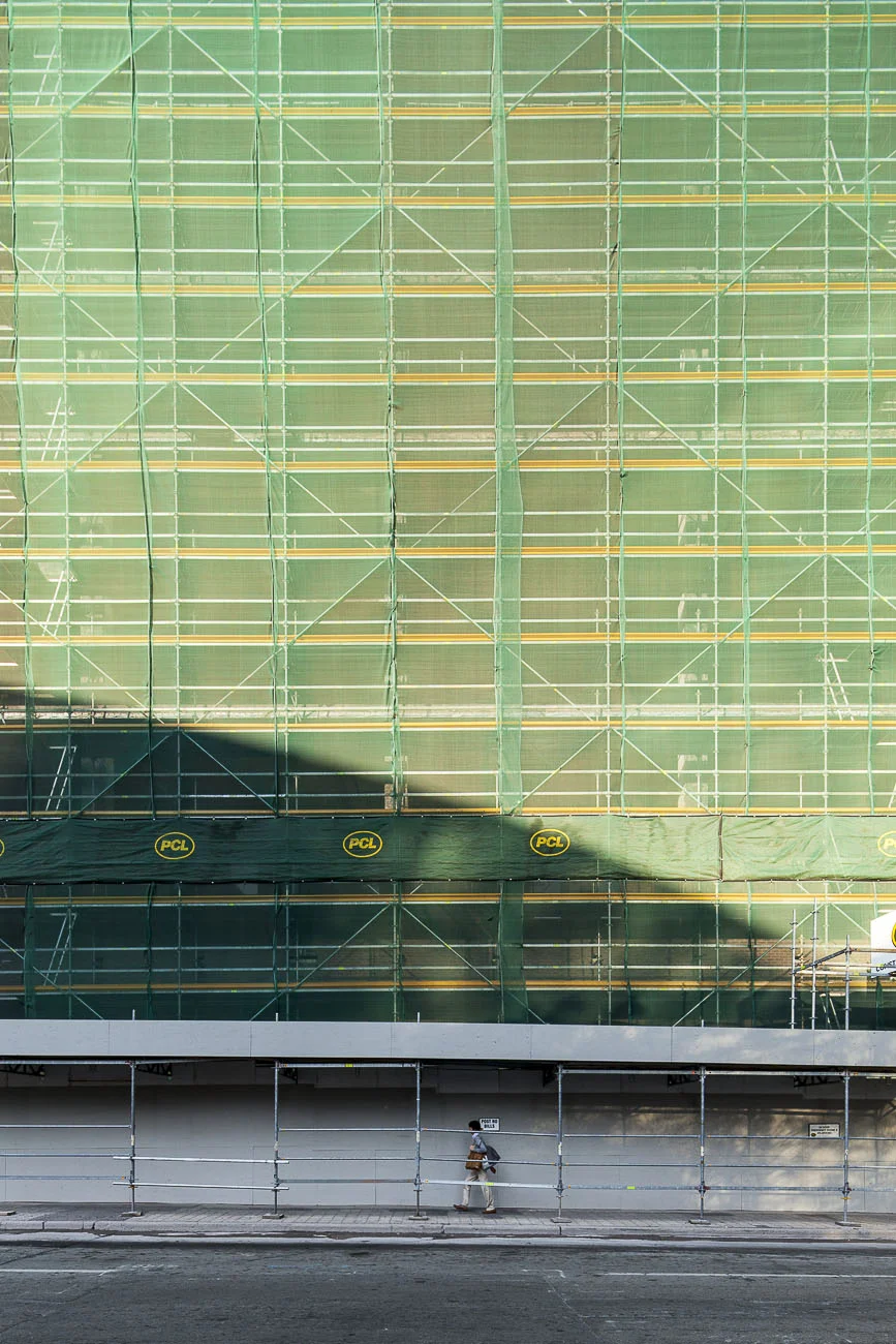
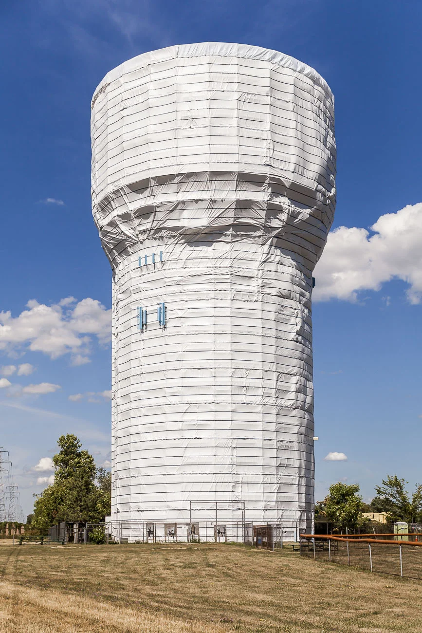
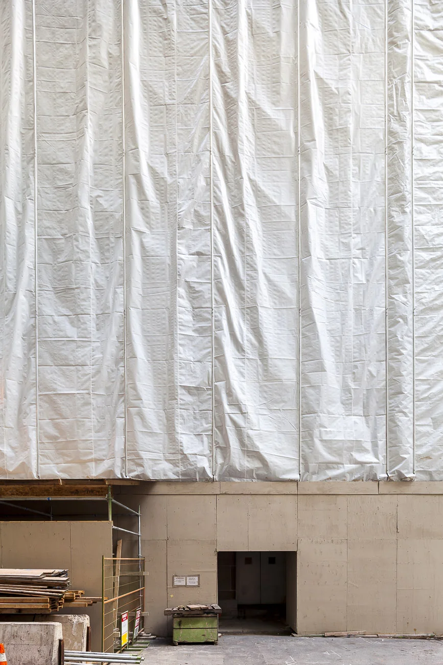
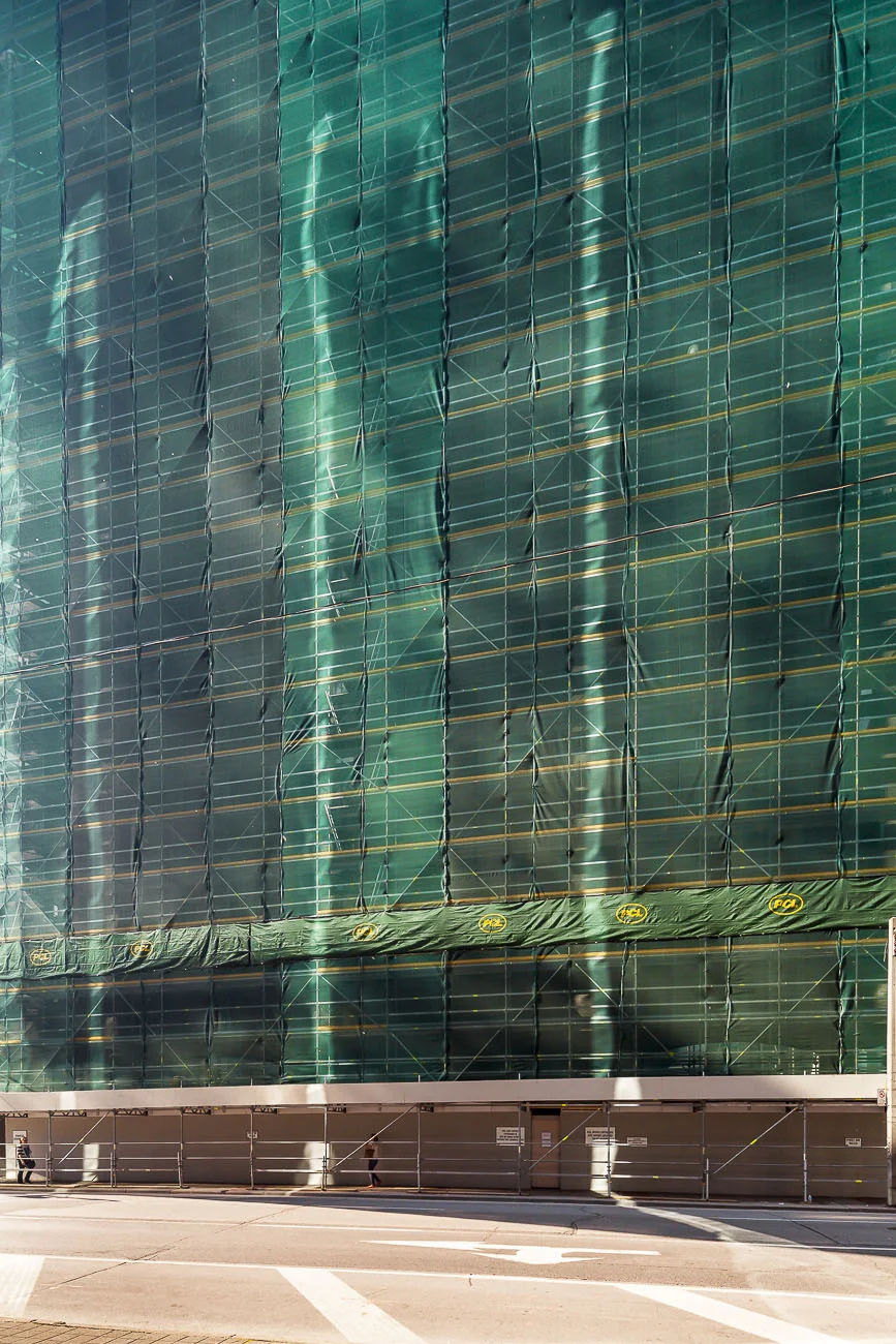
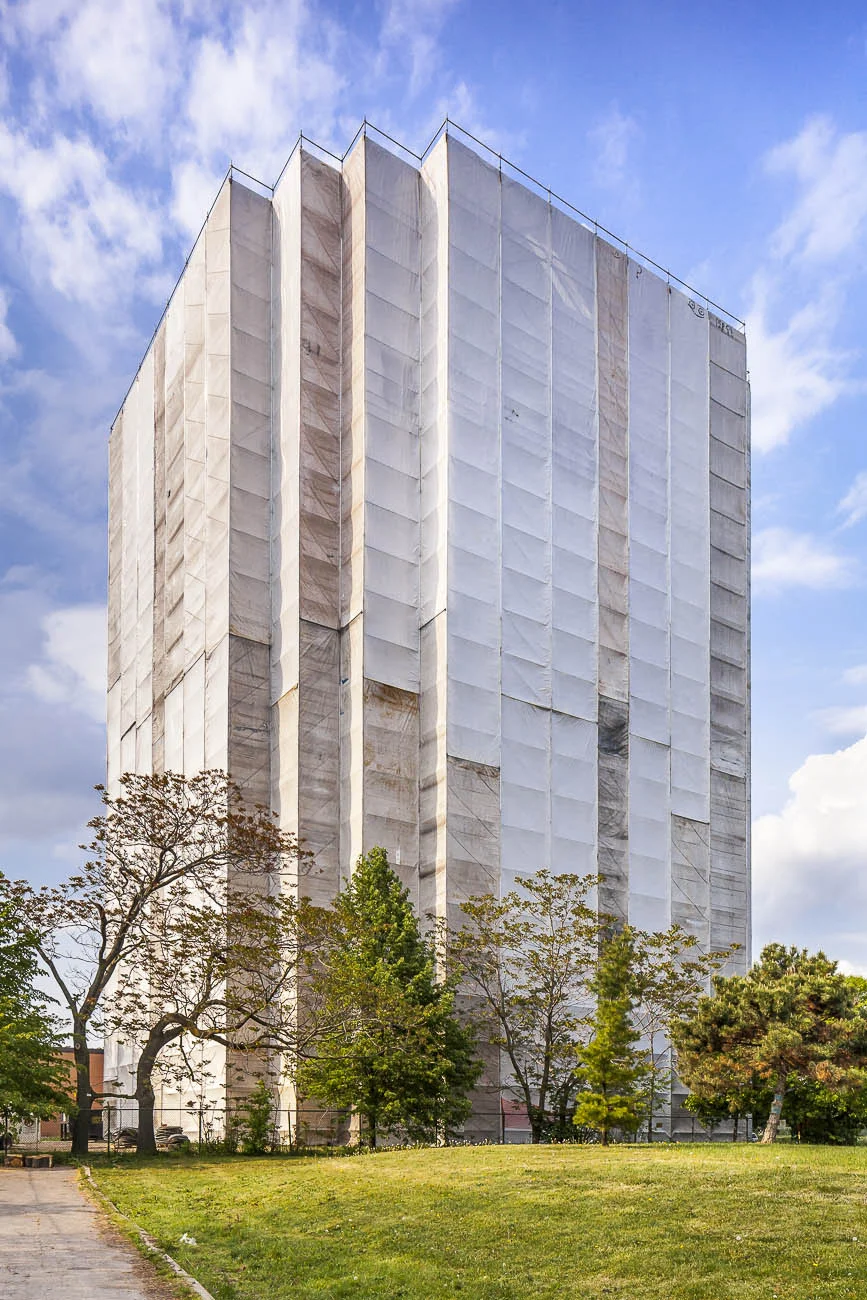
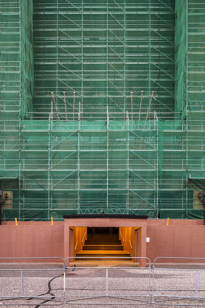
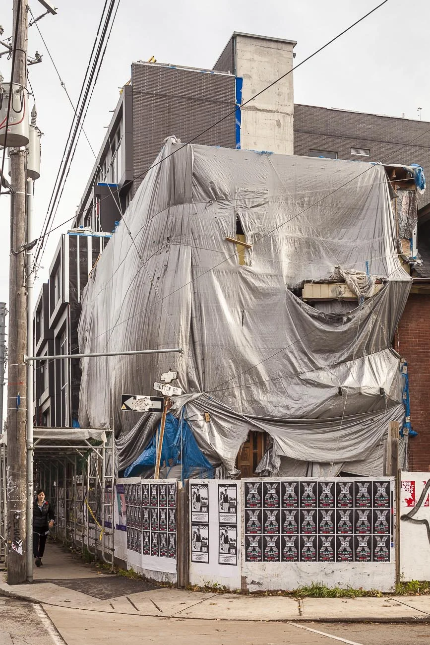
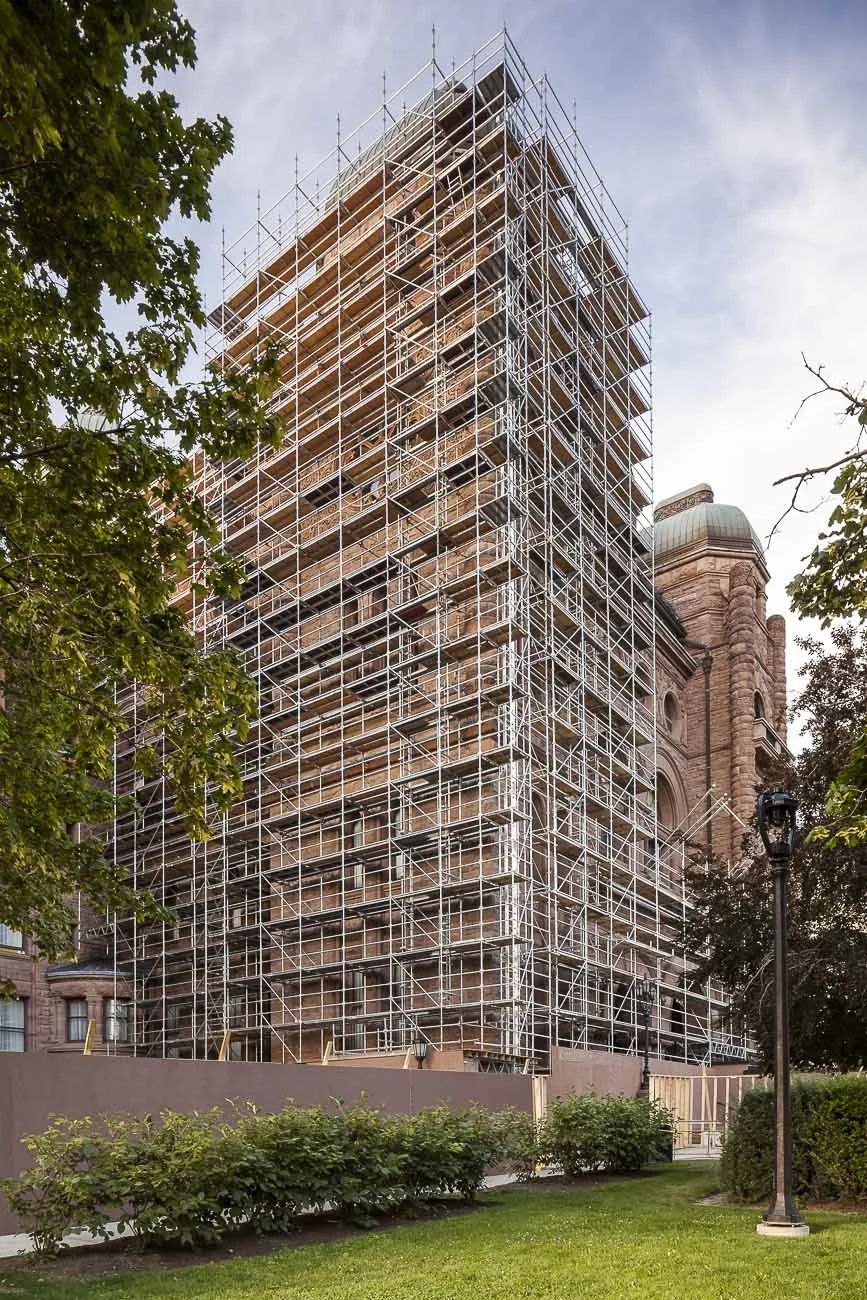
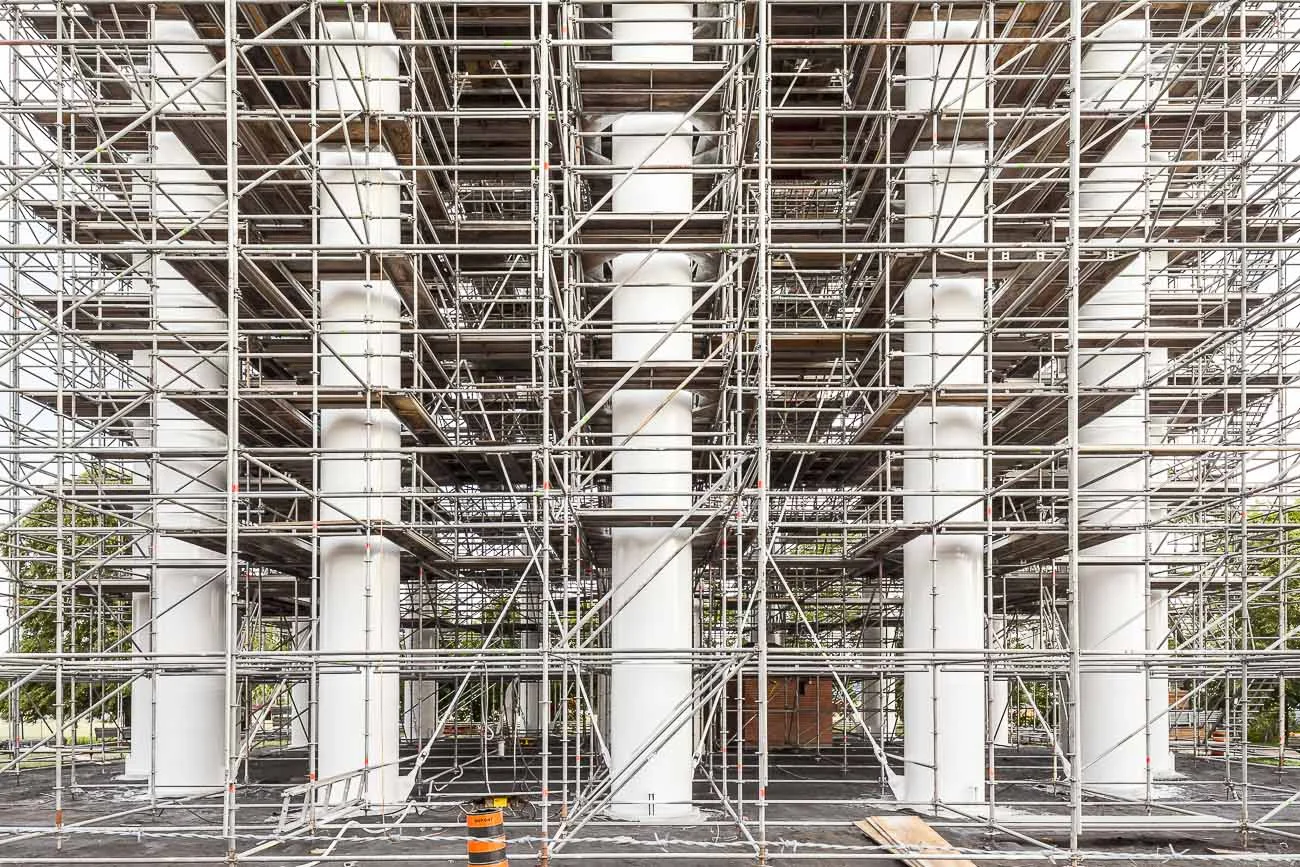
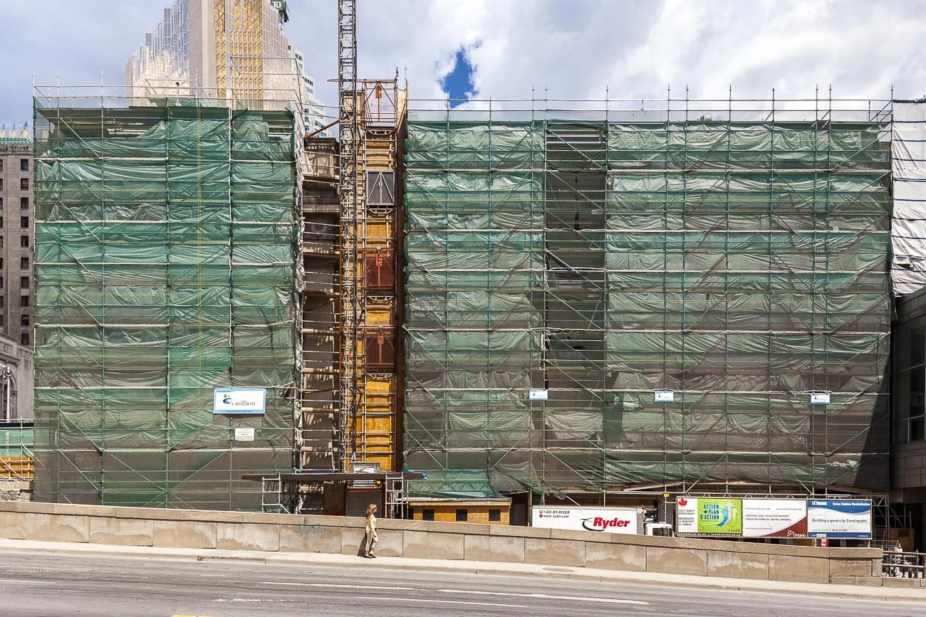
Eingehüllt is a study of the visual qualities of structures that have been modified by the addition of scaffolds and shrouds as part of a repair process. These temporary coverings create a change in our perception of the underlying objects. This effect has wider implications in our understanding of how we perceive things in general. The shrouds create a type of anonymous art, or in the language of this series ‘Kunst ohne Künstler’ (Art without an artist). Viewers are challenged to provide their own interpretations of the common forms beneath the shrouds.
The series was chosen for the 2012 RBC Emerging photographer award at RMG Exposed / Robert McLaughlin Gallery, Oshawa, Ontario.
The work was exhibited in a solo show at the Robert McLaughlin Gallery in 2013 as part of the Toronto Contact Photography event.
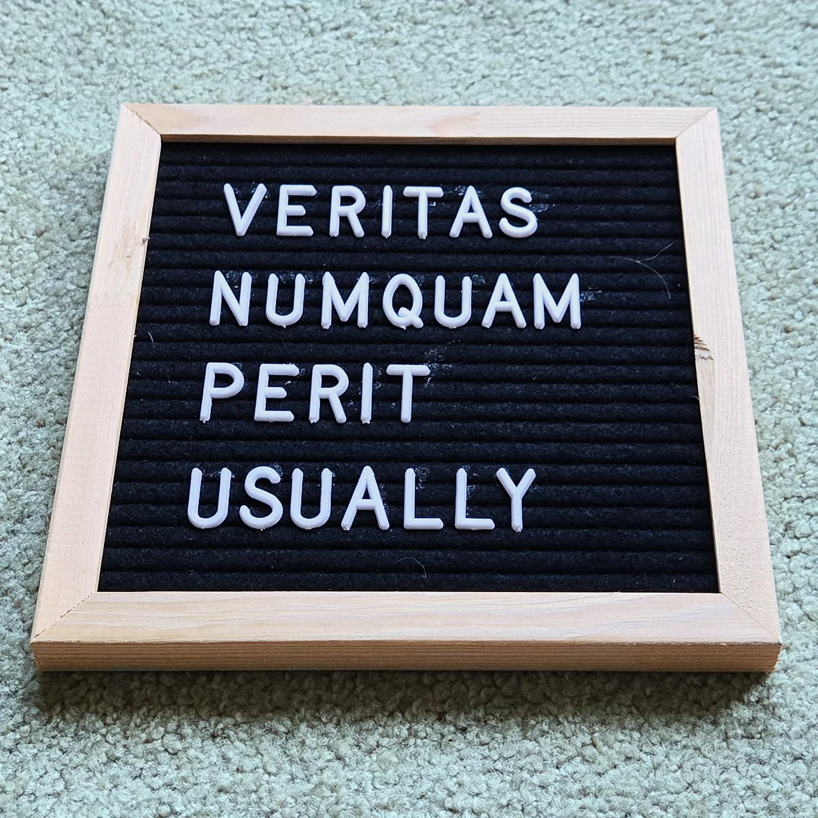
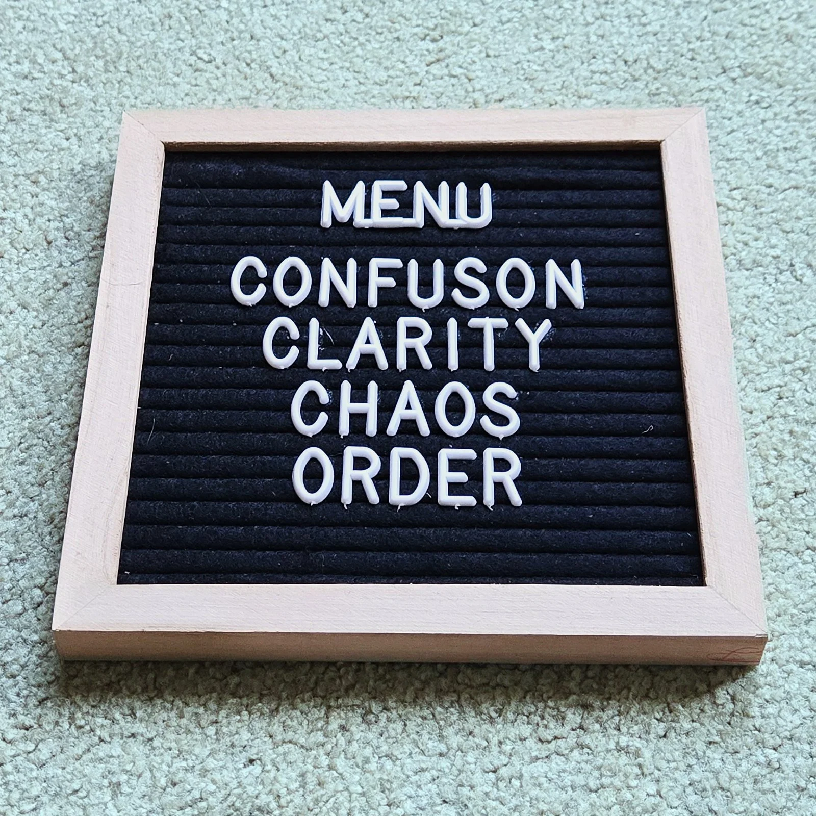
Menu for Living is a series of text-based works that use the familiar format of small felt menu boards, traditionally seen in diners and corner stores, to question what we consume and how we measure value in contemporary life. Each board features carefully chosen words and phrases, spelled out in white plastic letters, that at first glance resemble straightforward menu listings. On closer inspection, they reveal layered meanings, ironic juxtapositions, and playful critiques of cultural norms.
By framing ideas such as EXPENSIVE CONDOS / CHEAP PIZZA / DIRTY PARKS as though they were daily specials, the works underscore the contradictions of urban existence—luxury and scarcity, convenience and neglect, desire and disillusion. Other boards push language further into paradox, as with VERITAS NUMQUAM PERIT USUALLY—a phrase that destabilizes the certainty of truth.
Presented in this modest, ubiquitous format, the series draws attention to how language shapes lived experience, how choices are presented to us, and how value systems are advertised and internalized. Menu for Living blurs the boundary between the ordinary and the profound, offering viewers a space to reconsider what is truly “on the menu” in the structures of daily life.